Everyday work
- HomePrompts, composer and shortcuts
- ChatQuestions and follow-ups
- AgentsSpecialist and custom assistants
Product design case study
Designing a multilingual AI workspace around the things people want to do.
The challenge
Tatva brings voice, documents, specialist agents and language tools into one product. Presenting all of that capability at once can leave someone with a simpler question: where do I begin?
We organised the experience around three starting points: asking an everyday question, understanding a document, and creating an agent for a recurring task. Each starts with a familiar action and reveals more options as they become useful.
A prompt, a document or a specialist agent.
Choose a language and provide what the task needs.
Read the response alongside its supporting source.
Ask a follow-up, save the answer or translate it.
Information architecture
The navigation separates a conversation from its source material, and everyday tasks from workspace configuration.
A suggested prompt, feature card and sidebar item can lead to the same tool. This gives a newcomer a task-based entry point while allowing someone familiar with the product to go directly to a destination. The grouping above explains the structure; the desktop prototype keeps all nine destinations visible in one sidebar.
Scenarios guiding the design
A first-time visitor needs a useful example, a visible composer and a clear next action. The home screen introduces capability through tasks.
Someone reading a document needs a concise answer and an easy way to check it. Summary and source stay connected.
A recurring workflow needs a name, purpose and reusable context. Agent setup turns those choices into an identifiable assistant.
The workspace
The home screen balances a direct route to a question with visible ways to explore the platform.
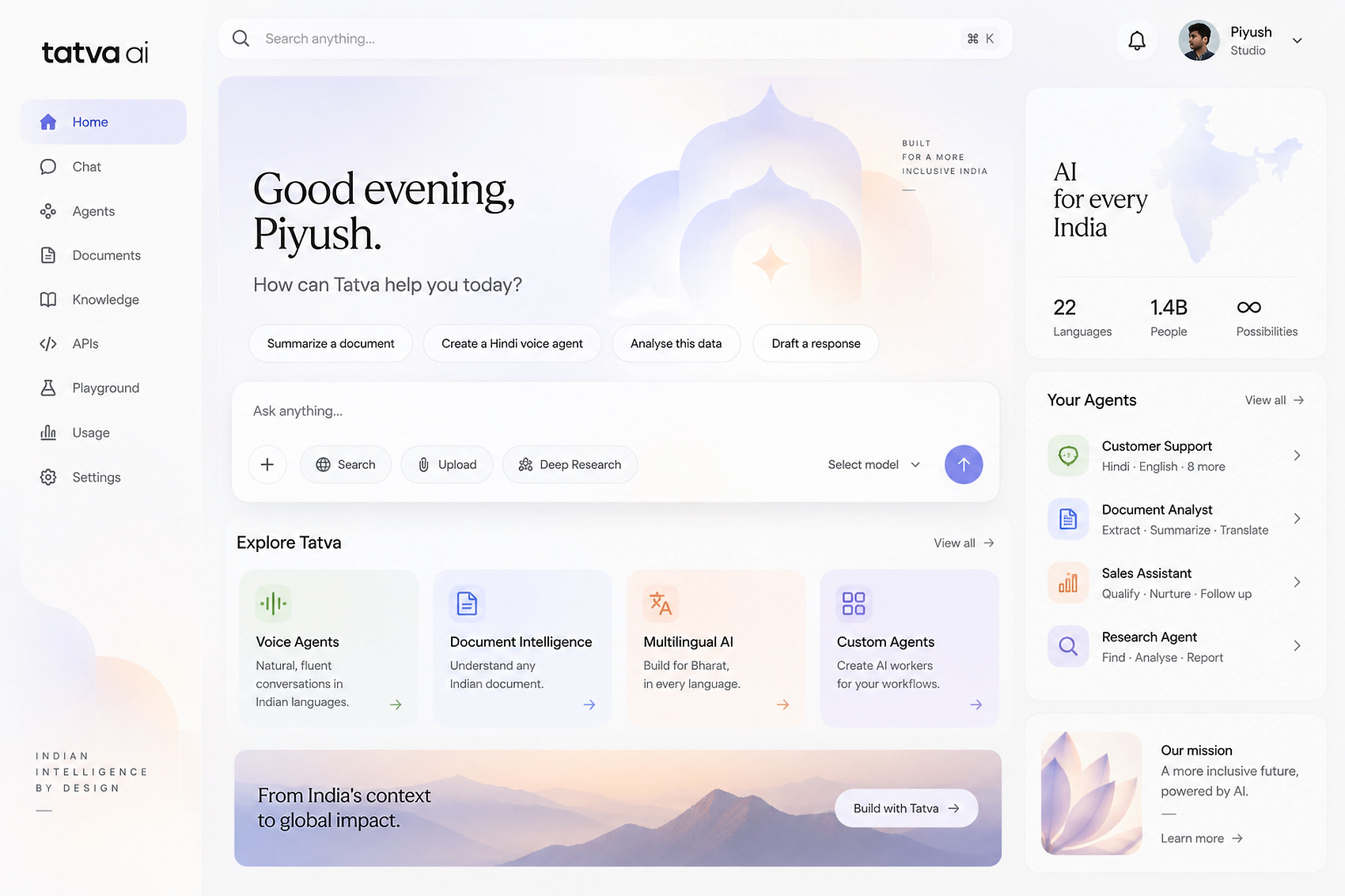
Suggested tasks sit close to the composer. Someone can summarise a document or draft a response without first learning the product’s navigation.
Voice, documents, multilingual AI and custom agents each have a clear entry point. The sidebar keeps frequently used destinations in a consistent place.
The agents panel gives recurring tasks a recognisable home. It connects the broad platform to specific jobs such as support, analysis and research.
YOUR DOCUMENTS
A weekly space to share stories in the language you love.
Trust & context
A summary is useful when someone can understand where it came from. On desktop, the document and answer sit beside one another. Selecting a citation highlights the relevant passage.
“A weekly gathering for neighbours to discover stories together.”
Source 1 · The ideaOn mobile, a compact source label keeps that connection visible. Summary, action and translation views offer different ways to work with the same document.
Explore the desktop prototypeKey task flows
Each flow has an entry, a decision and a visible result. The prototype makes those connections reviewable.
The reading club brief is the shared sample across the experience. Keeping the content consistent helps explain how a document becomes a summary, an action or a translated phrase.
Enter through the home suggestion, Documents or the saved brief in Knowledge. The file name and sample label establish the context.
Summary, Actions and Translate sit above the same document. Changing the task preserves the source instead of opening a disconnected tool.
Select “View the first gathering” to highlight the matching source passage. The answer points back to evidence at the moment it is needed.
Switch to Actions for a short checklist, or choose a language in Translate. A source remains available while the presentation changes.
A name alone is not enough context. The builder brings purpose, language, tone and a sample source together, with an adjacent card showing the assistant’s identity.
Explore a specialist agent or select Create an agent. Both routes lead into the same configuration space.
The form asks “What do you want your agent to do?” so the instruction begins with a job, rather than technical model terminology.
Language, tone and a sample-document option make the relevant choices visible. A voice preview offers a separate view of the conversation interface.
The saved agent appears under Your agents with its chosen name and language. It can be reopened for editing during the preview session.
Prototype scope: the builder demonstrates configuration and saving. It does not deploy an agent, connect a knowledge source or run a language model. Tone and source controls illustrate the proposed setup.
Language & mobile
Language selection appears at the start of the app. The greeting then reflects that choice, while the same core tasks stay recognisable across screens.
The voice interface gives a conversation a visible rhythm through a listening shape, a waveform and a clear pause control. Translation keeps the original phrase and translated result together.
These flows are demonstrated with prepared Hindi, English and Tamil examples. Wider language coverage and real speech behaviour need validation beyond the design prototype.
Explore the app screensDesigning for the app
The app concentrates on language, conversation and reading. The desktop workspace holds the broader set of tools.
English, Hindi and Tamil appear in their own scripts during onboarding. A check mark confirms selection; the next screen reflects that choice in its greeting. The prototype demonstrates selected phrases, not complete interface localisation.
The same identity artwork becomes part of the voice experience. A waveform, status caption and start/stop button work together, so motion carries a state and the user has an explicit control.
The translation screen stacks the original and result, names each language and provides a swap control. Saving a phrase produces a visible confirmation without moving someone away from the text.
Interaction details
An interface needs to explain what has changed, what is selected and what can happen next.
| Moment | Interface response | Design reason |
|---|---|---|
| A new conversation | A welcoming empty state offers suggested tasks alongside the composer. | Make the first action easier to identify. |
| A document is attached | A named sample-file chip appears with a remove action; the draft stays in place. | Keep the question and its context visible together. |
| A citation is selected | The relevant passage is highlighted in the source document. | Connect a generated summary to specific evidence. |
| An answer is saved | The control confirms saving, and the answer becomes available in Knowledge. | Show both completion and where to find the result. |
| Search finds no tool | A short message suggests searchable examples such as documents, voice or agents. | Offer a next step after an unsuccessful search. |
| Voice starts or stops | The status text, motion and button change together. | Make the listening state visible and controllable. |
| Preferences are saved | The button confirms the action and the profile name updates in the header. | Provide immediate feedback close to the action. |
A production experience would also need upload progress, unsupported-file feedback, timeouts, microphone permission handling and a way to recover after a failed request. Those states should preserve the user’s input and explain a useful next step. They remain part of the next design and engineering phase.
Visual system & accessibility
The illustration family gives Tatva a recognisable character. Text, spacing and interaction states carry the practical work.
Soft gradients belong to illustrations and welcome areas. Form labels, document passages and actions sit on quiet surfaces so the decorative language supports reading.
Labels such as “Save preferences”, “View the idea” and “Translate to” explain what a control does. Icon-only controls receive accessible names, while selected tabs and navigation items expose their state.
The identity loop includes a pause control and respects reduced-motion preferences. Voice also provides a text status; animation is not the only indication that the preview has started.
Responsive layouts are part of the prototype. The next accessibility review should test contrast, zoom, keyboard paths, screen-reader announcements and Hindi and Tamil text with people who use those languages.
What comes next
The design connects the workspace, documents, agents and mobile flows in a shared visual language. The next step is to test whether those choices make real tasks easier. Begin with first-time AI users, people who regularly work with documents and people configuring recurring workflows. Include speakers of the demonstrated languages rather than evaluating every flow only in English.
Ask first-time users to summarise a document and create an agent. Record their first clicks, wrong turns, hesitation and whether they can complete the task without help. Use those observations to revise labels and entry points.
Ask people to verify a statement against its document. Check whether they discover citations, identify the correct passage and distinguish a source statement from the generated summary. Completion alone would not show whether they understood the evidence.
Test comprehension with speakers of each supported language, then check voice feedback, text scaling and keyboard access. Ask participants to explain the result in their own words and note where translation or interface language creates uncertainty.
These are proposed validation steps. This case study documents the design rationale and prototype, without claiming research results or measured product outcomes.
One identity. A connected product experience.