ScrollControl
Making digital safety
feel a little more human.

The challenge
Digital wellbeing, by designHow do you make a complex digital world feel safe enough to explore?
A serious subject.
A more open conversation.
Parents need clarity. Teachers need a way to help. Children need room to grow. ScrollControl brings them together through content ratings, learning, and digital safety tools.
We gave that ambition a shared visual language. One that feels optimistic, recognisable, and easy to find your way around—from the first visit to the tools people use every day.
The identity
Built to be recognisedOne mark.
A whole world of possibility.
A bold, compact wordmark anchors the system. Its rounded forms find company in circles, cut-outs, and expressive type. A serious purpose, with a character of its own.

BIG ON
CONFIDENCE.
A friendly face.
A clear voice.
Expressive display type does the talking. Rounded, readable text does the explaining. Together, they make room for both personality and practical guidance.
Colour gives every part of the experience its own place, while keeping the whole family together.
The brand in the world
Made to leave
the screen.
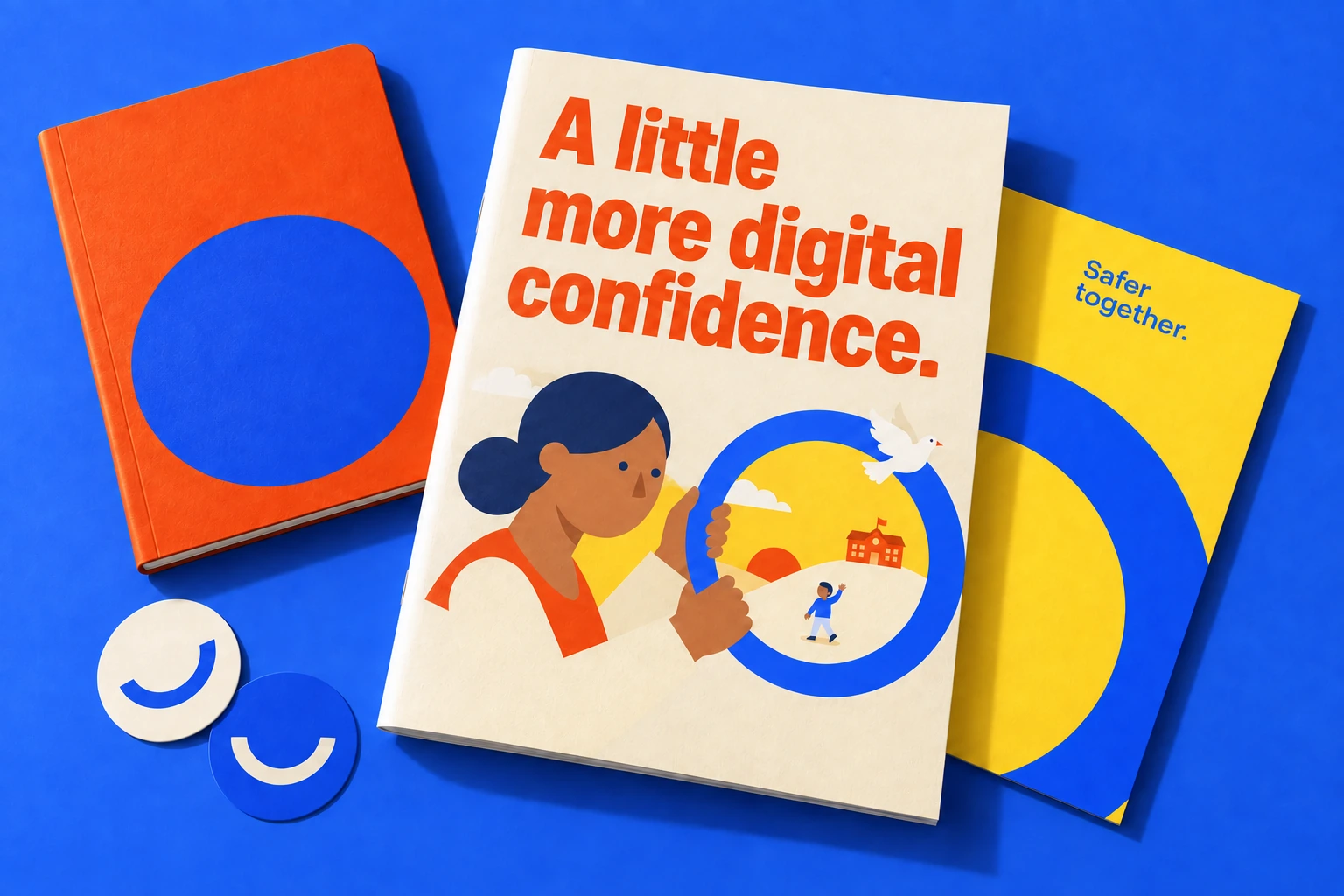
A learning kit on the kitchen table. A message on the school wall. Application studies explore how the same identity can turn up in the places families already know.

The idea, in motion
It takes
all of us.
The circle became more than an illustration. It became a way to explain how ScrollControl works.
- Parents
Clarity for the conversations at home.
- Teachers
Confidence to recognise risk and respond.
- Children
Skills for a world they’re still discovering.
Scroll to bring the circle together
together.
 Parents
 Teachers
 Children
Art direction
A world you
can see yourself in.
Indian families, familiar classrooms, and a cast of warm, expressive illustrations. We built a visual world that puts people at the heart of digital safety.



UI / UX design
A clearer way
to choose.
Parents arrive with different questions. A title to check. An age to consider. A new phrase they don’t understand.
We shaped the interface around those starting points, carrying the brand’s warmth into the practical details of finding, understanding, and choosing content.
01 / The homepage
Explore the design decisions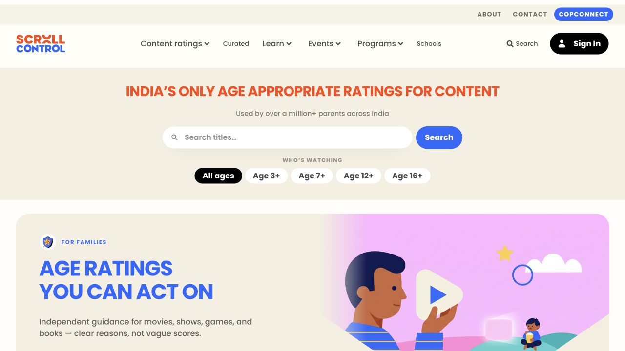
A clear first action
Start with what they came for.
Title search sits at the centre of the homepage. A single, familiar input gives parents a direct route into the catalogue when they already have something in mind.
Actual platform screens with design annotations. Explore the working website below.
Beyond the homepage
Different questions.
The same thoughtful approach.
Less lost in
translation.
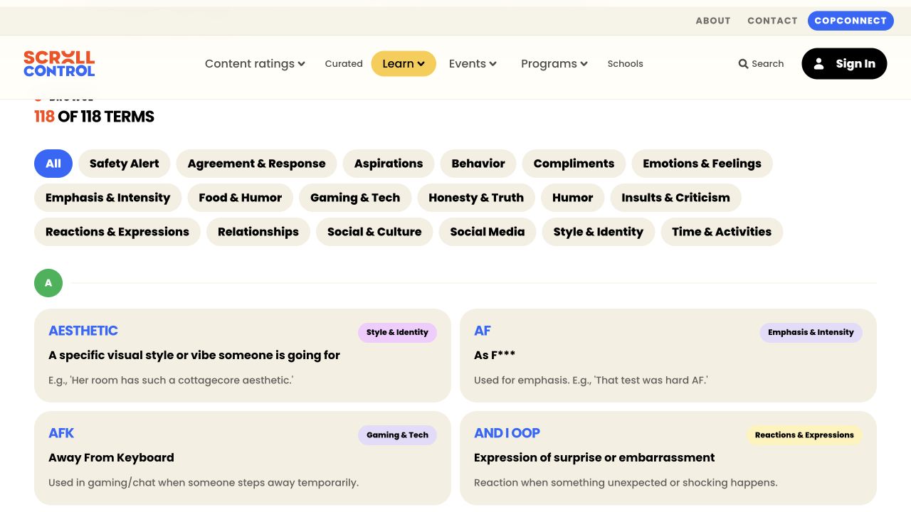
The glossary lets parents search a term, its meaning, or its context. Slang and emoji paths give unfamiliar language a recognisable place to live.
Clear categories and plain-language explanations help turn an unknown phrase into a starting point for conversation.
One small decision
at a time.
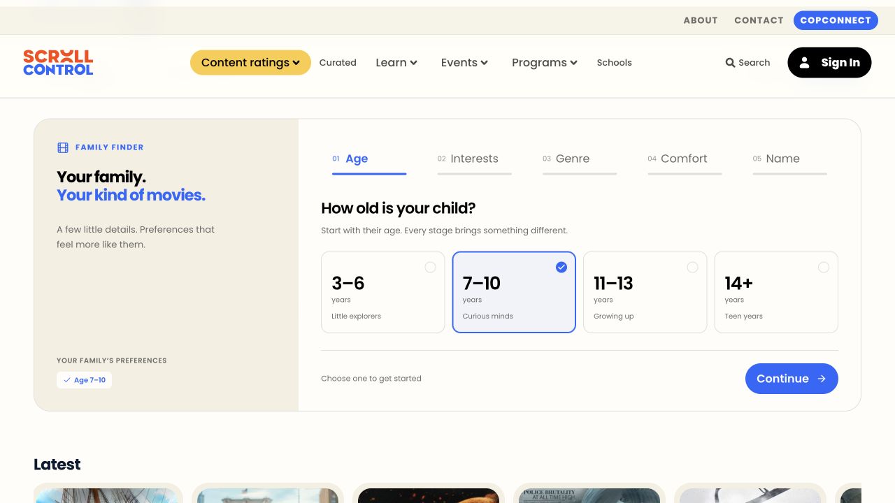
Family Finder breaks preferences into five steps: age, interests, genre, comfort, and name. One question at a time keeps the immediate choice in focus.
A visible progress indicator and growing answer summary keep the journey legible. Families can return to completed steps and adjust their choices.
The experience in three moves
From a question
to a considered choice.
- 01
Find
Search a title, set an age, or explore a familiar shelf.
- 02
Understand
Read the age guidance. Make sense of unfamiliar language.
- 03
Choose
Bring the child’s interests and the family’s comfort into the decision.
A connected set of routes through the platform, with room for every family to make its own call.
The working platform
Take it for
a scroll.
Explore the website, browse the content library, or try the glossary. The live window below brings the design details into an experience you can use.
Scroll inside to explore the live website.
Continue the storyOne story. A clear way in.
A shared starting point for families, schools, and children. Illustrated storytelling introduces the idea; clear pathways help each audience find their next step.
What we brought together
From an idea
to an ecosystem.
A shared design system
Typography, colour, imagery, and components that carry across the marketing site and product.
A story people can follow
Illustration, scroll sequences, and audience pathways that make a complex service easier to understand.
A connected digital experience
Website, content discovery, and learning tools with a consistent, recognisable character.
Project credits
Design system, art direction, website and product redesign by KURO KOKORO.
For ScrollControl, an initiative of ISAC Foundation.
Have something complex to make clear?
Let’s give it character.