Sapphire
Homes
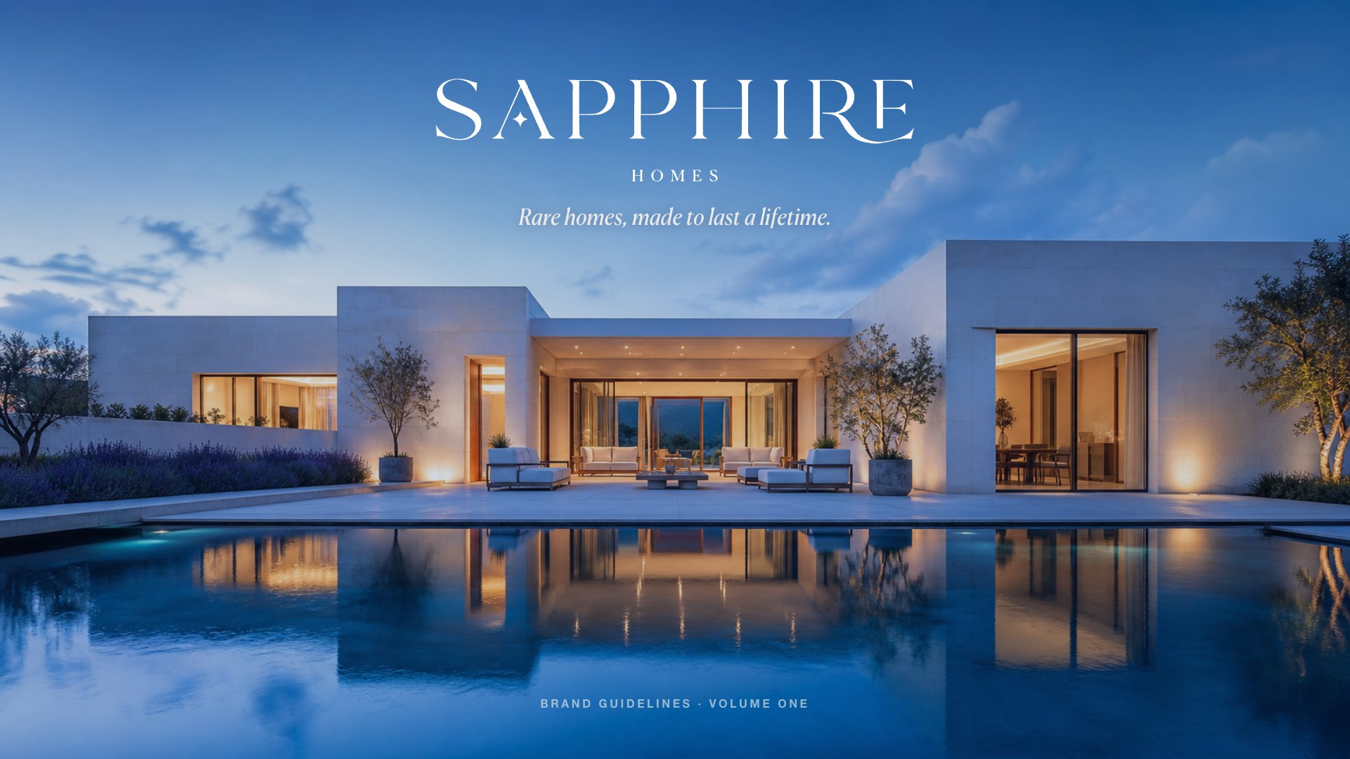
Rare homes, made to last a lifetime.
Read the brand book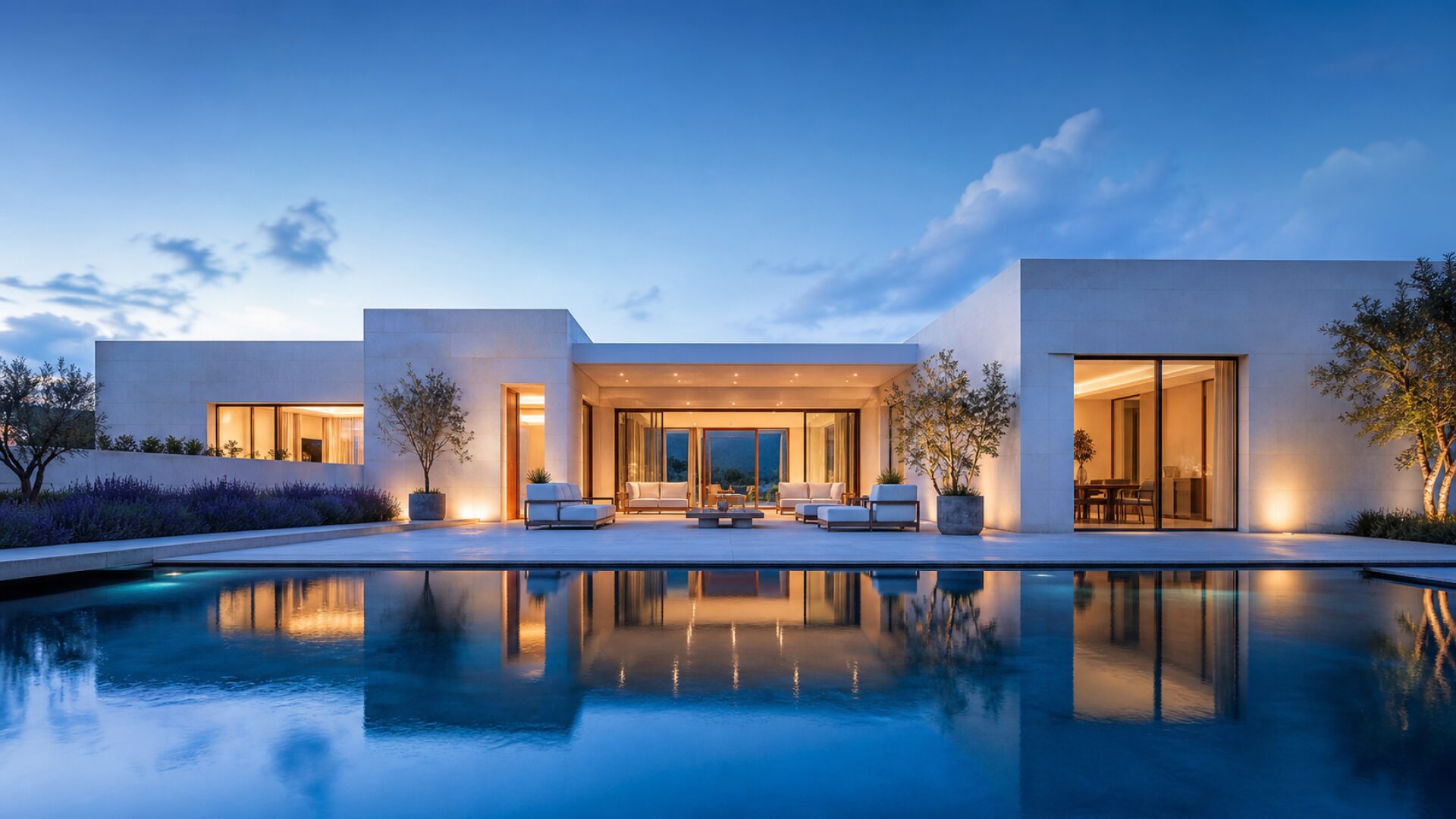
The challenge
Collected, never flashyA home is the one thing you should never have to think about twice.
Quiet luxury,
built in stone.
Sapphire Homes is a luxury real-estate brand for buyers who value permanence, craft, and quiet confidence over loud opulence. The name evokes a precious stone — rare, enduring, deep, refined. Everything that carries the name should feel collected, never flashy.
The identity brings a gem-inspired mark, deep sapphire and tactile materials together. We carried that language into stationery, campaigns, signage and the moment a home is handed over.
The identity
One family, five rolesThe most important asset.
A high-contrast elegant serif with the sapphire star nested in the “A”. Set it large. Give it room. Let it carry the brand. The four-point star is the ownable device — a cut gem’s glint — used once per layout, never as decoration.


Rare homes,
made to last
a lifetime.
Two families,
one voice.
A high-contrast display serif for expression; a quiet grotesque for everything that must simply be read. One display + one body, max.
Ivory-heavy, sapphire-deep, gold-rare. 60 space, 30 ink and sapphire, 10 greige and brass.
The identity, in the world
Considered.
Down to the last detail.
From a first impression to a set of keys. A single, quiet language for every encounter.

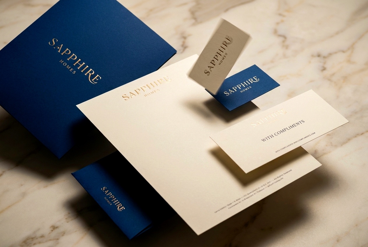
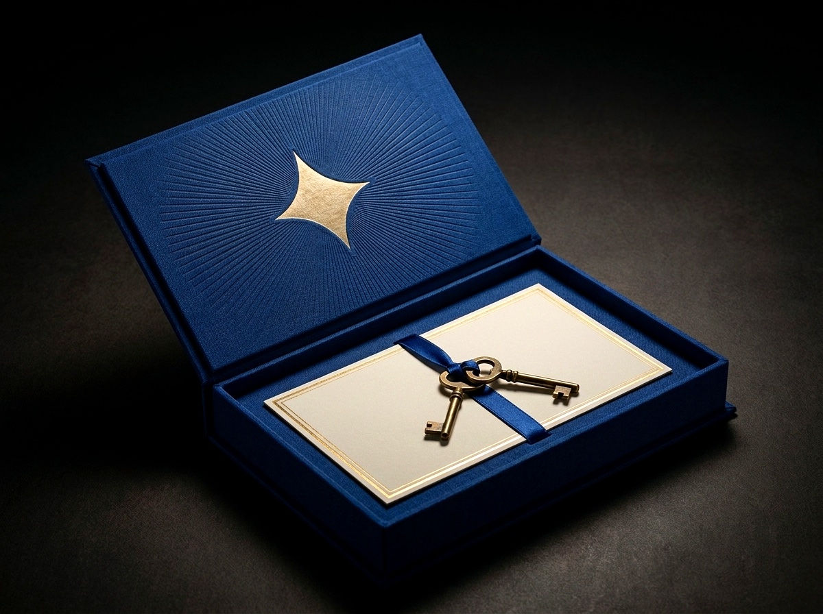
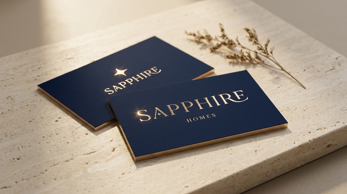
The mark scales from a business card to the spaces people move through.
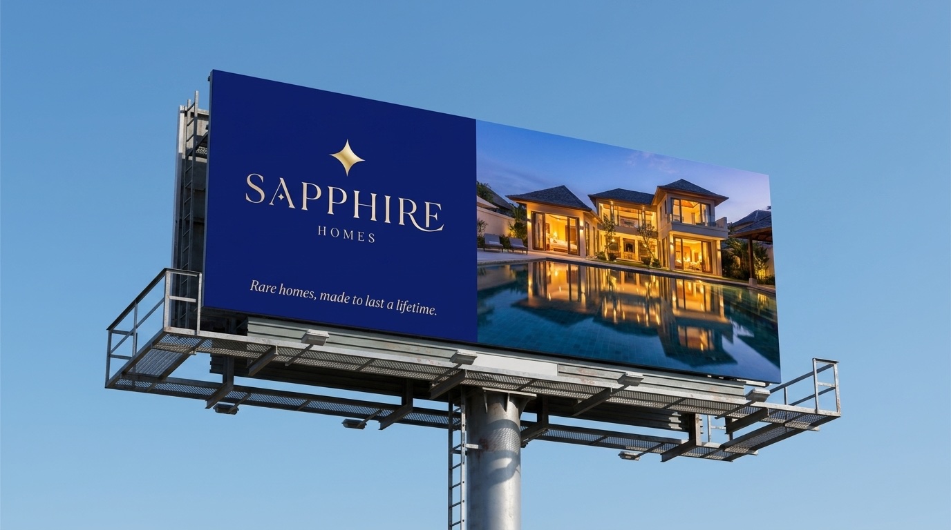
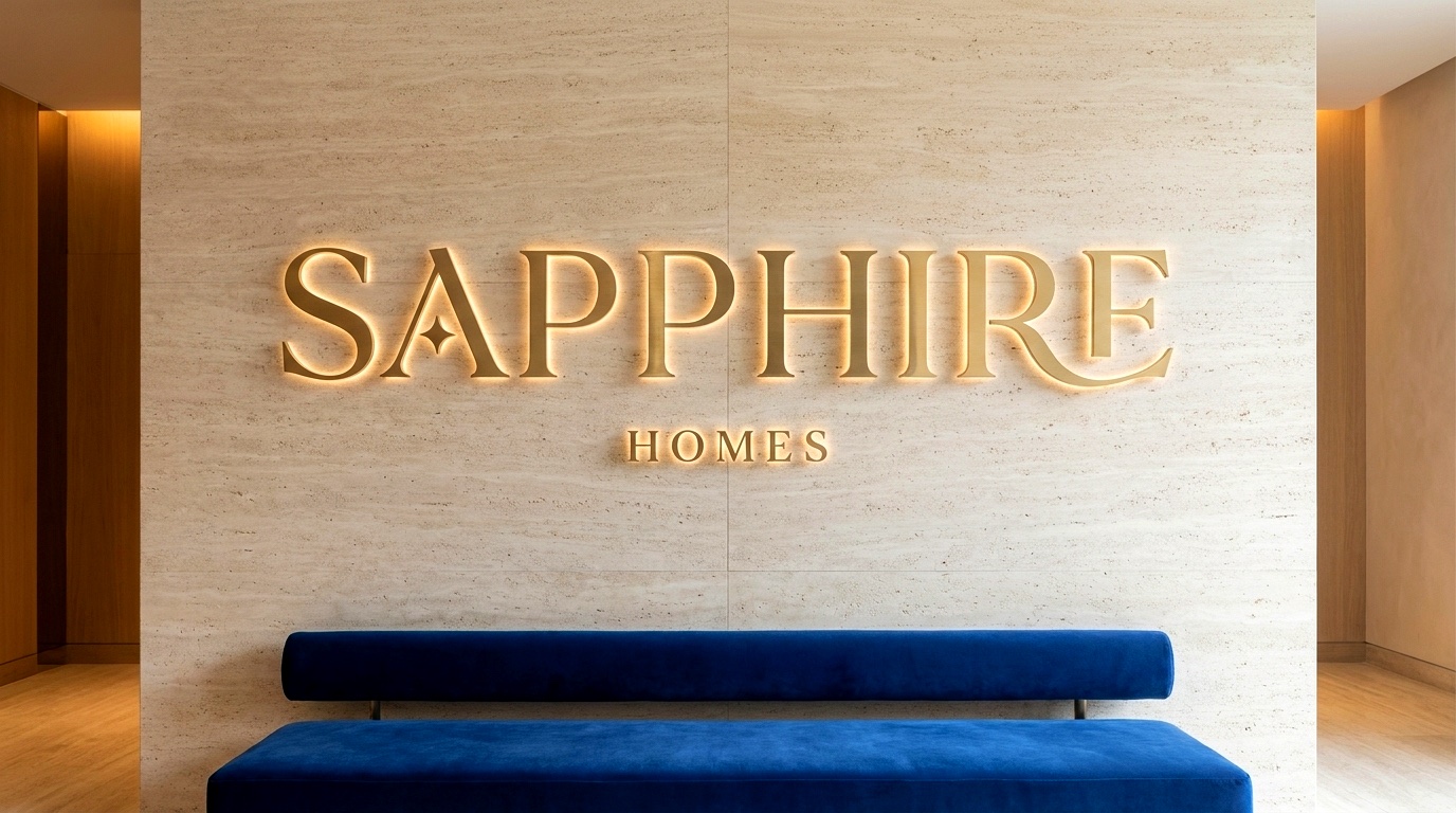
Four things we hold
The art of
the lasting home.
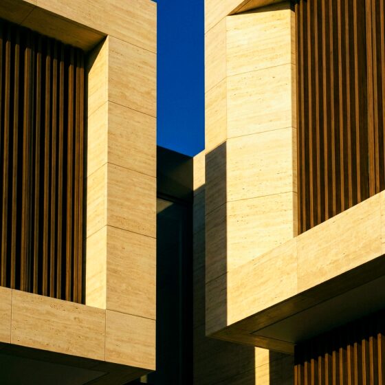
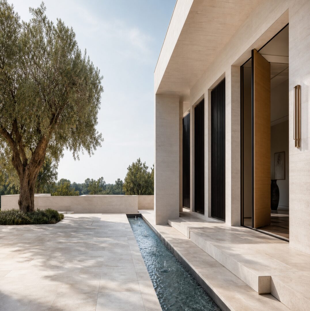
Natural light, golden or blue hour. Restraint and negative space. Materiality — stone, oak, brass, linen, marble. One muted grade across every image.
- Craft
Materials, detail and finish are the hero.
- Permanence
Built to outlast trends.
- Discretion
Confidence without shouting.
- Belonging
A home, not a property.
Scroll through the world
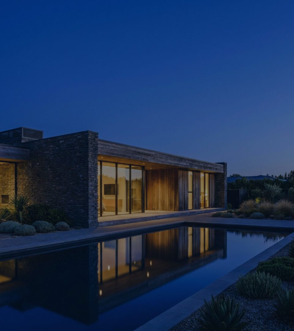
What we brought together
From a stone
to a system.
A shared design system
Typography, colour, imagery, and rules that carry across the brand book, stationery, signage, and gifting.
A mark with one job
Five lockup roles, one sparkle, clear space equal to the height of the “S”.
A world that stays calm
Magazine-grade, not billboard-grade. Sapphire wins by being the calm one in the room.
Project credits
Identity and brand guidelines by KURO KOKORO for Sapphire Homes.
The complete brand book
Keep turning.
A closer look at the thinking, the system
and every detail that holds it together.
Have something that should last?
Let’s give it character.