Jasmine
Farms
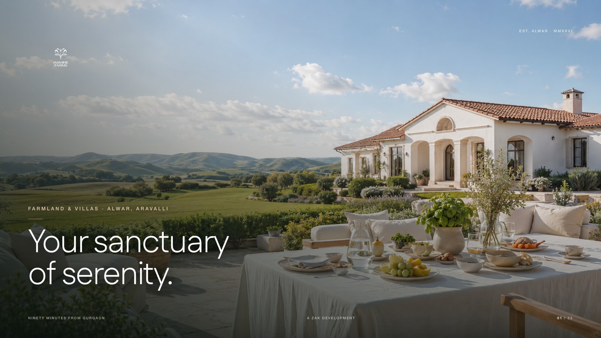
Your Sanctuary of Serenity.
Read the brand book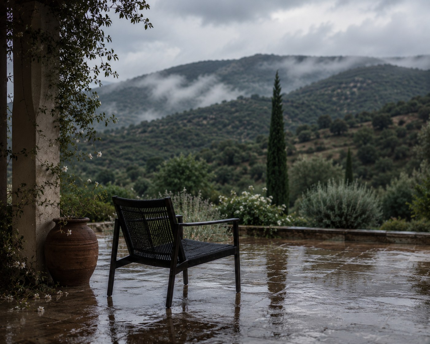
The challenge
Calm, warm, never loudYour sanctuary of serenity.
The land is the luxury;
the words only get out of its way.
Fifty farms across fifty acres, held lightly against the oldest hills in India. A place where the day slows down, the air clears, and every plot is simply room to breathe.
We shaped a botanical identity and a calm visual language, then brought it into the estate entrance, printed matter, campaigns and welcome pieces. Every touchpoint feels open, unhurried and cared for.
The identity
A jasmine, drawn openThe flower and the field.
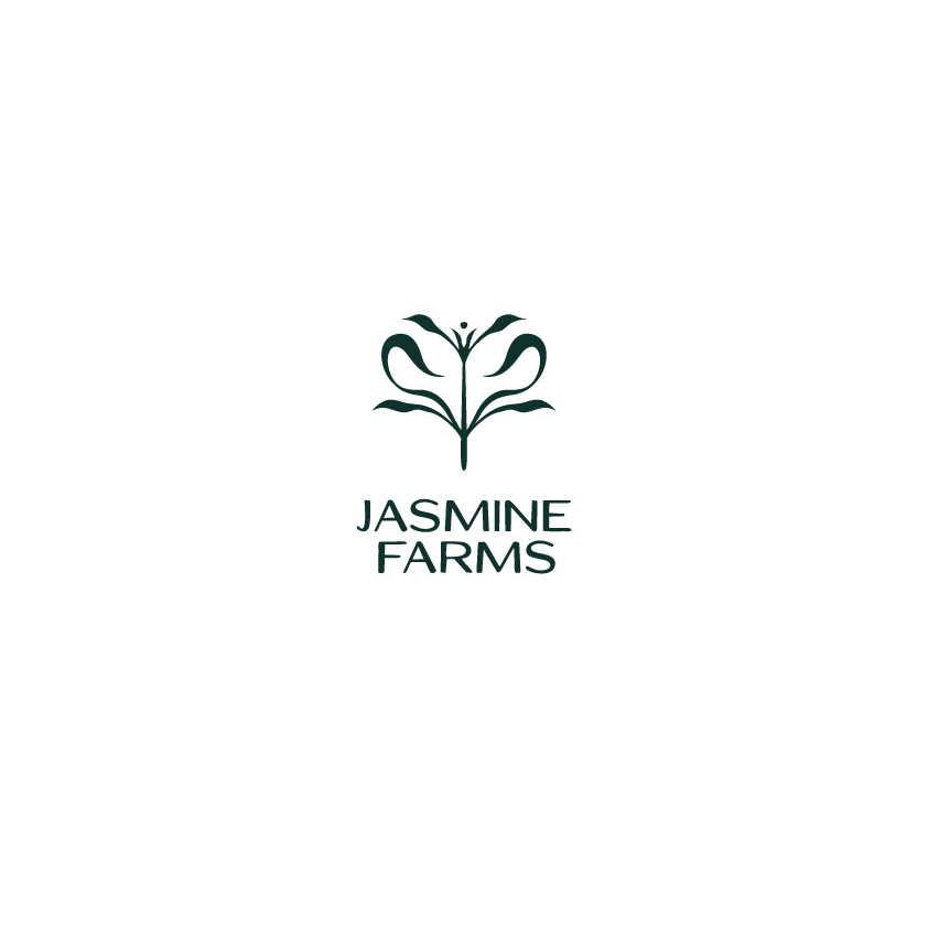
The symbol is a jasmine in bloom · five strokes opening from a single stem, equal parts botanical and architectural. A flower up close; a mark from across a field.

Your sanctuary
of serenity.
Two voices,
one family.
Fustat for display, headline and reading. Helvetica Neue for the small structural type · masthead, labels, ledgers, folios. Tracked caps, never display.
Deliberately green-led. Estate Sage leads, Heritage grounds, Ivory Mist is the paper. Ochre is the single warm note · used like a stamp, never a field.
The identity, in the world
A place to arrive.
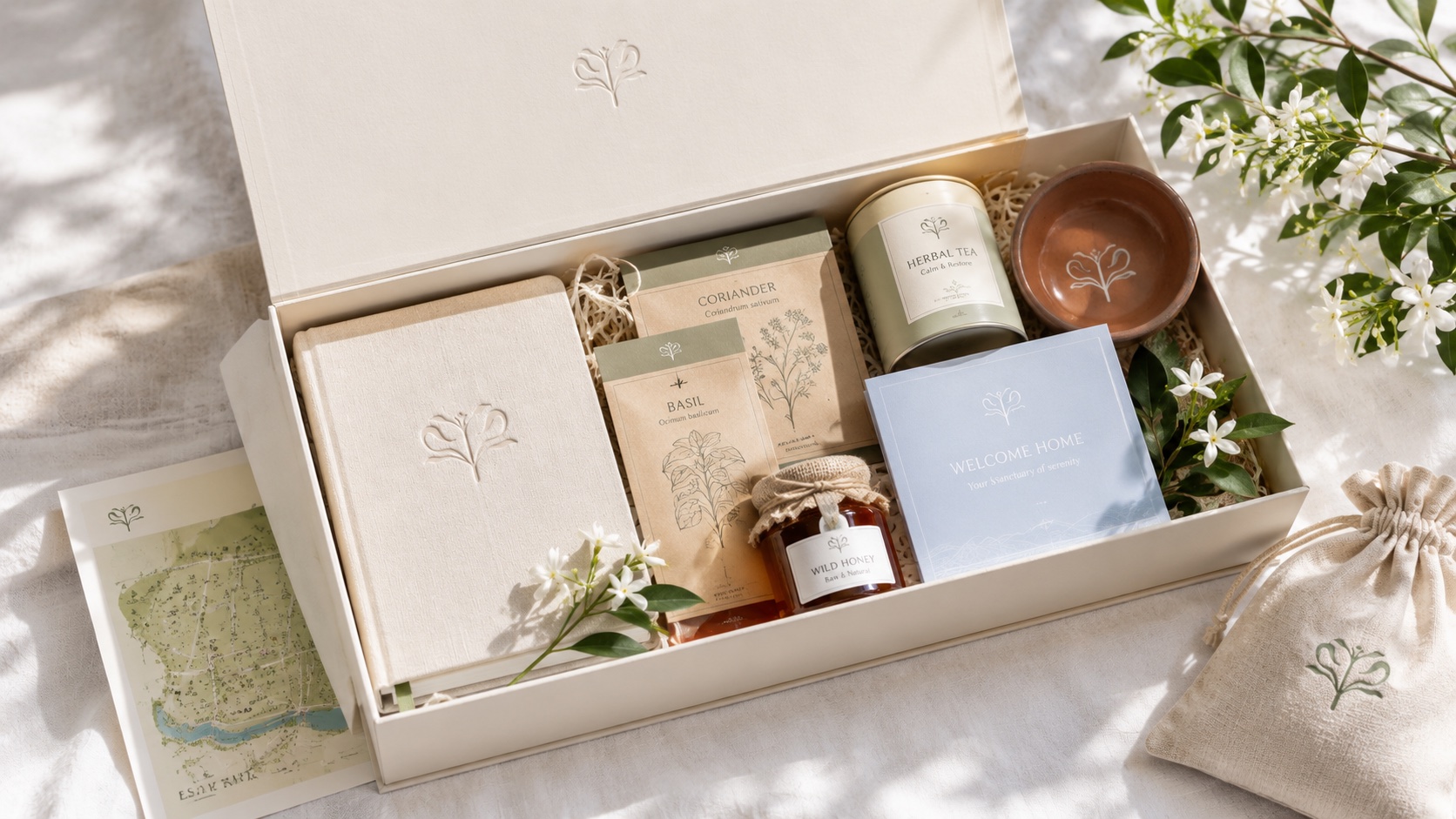
A feeling to take home.
The flower moves naturally from the landscape to the things you hold.
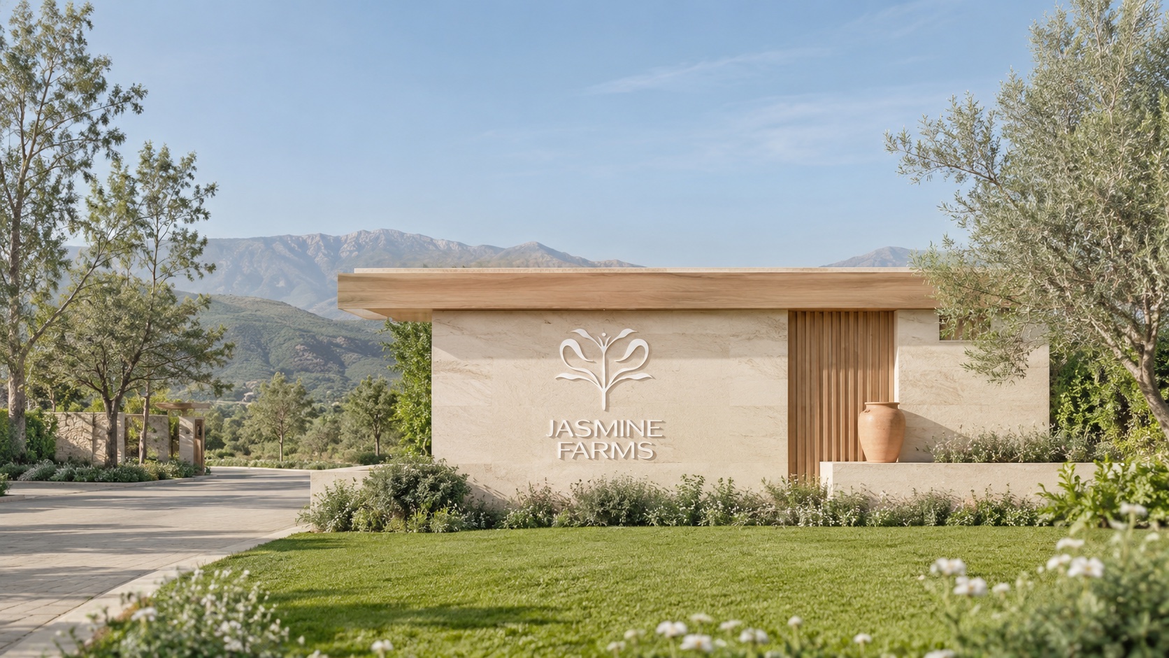
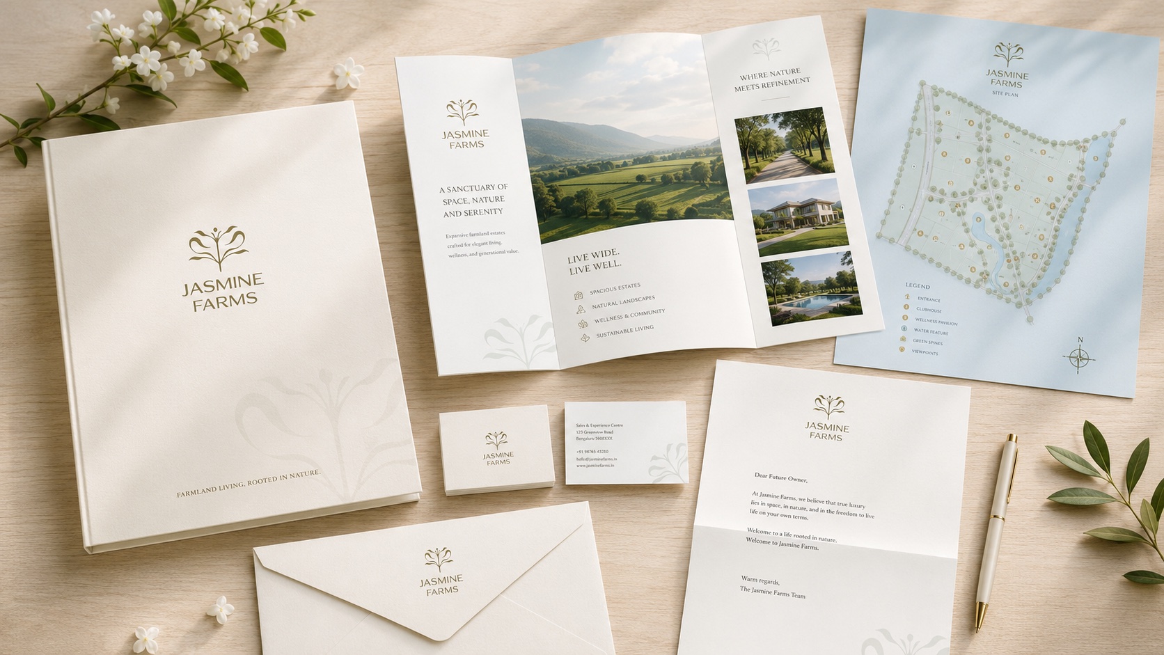
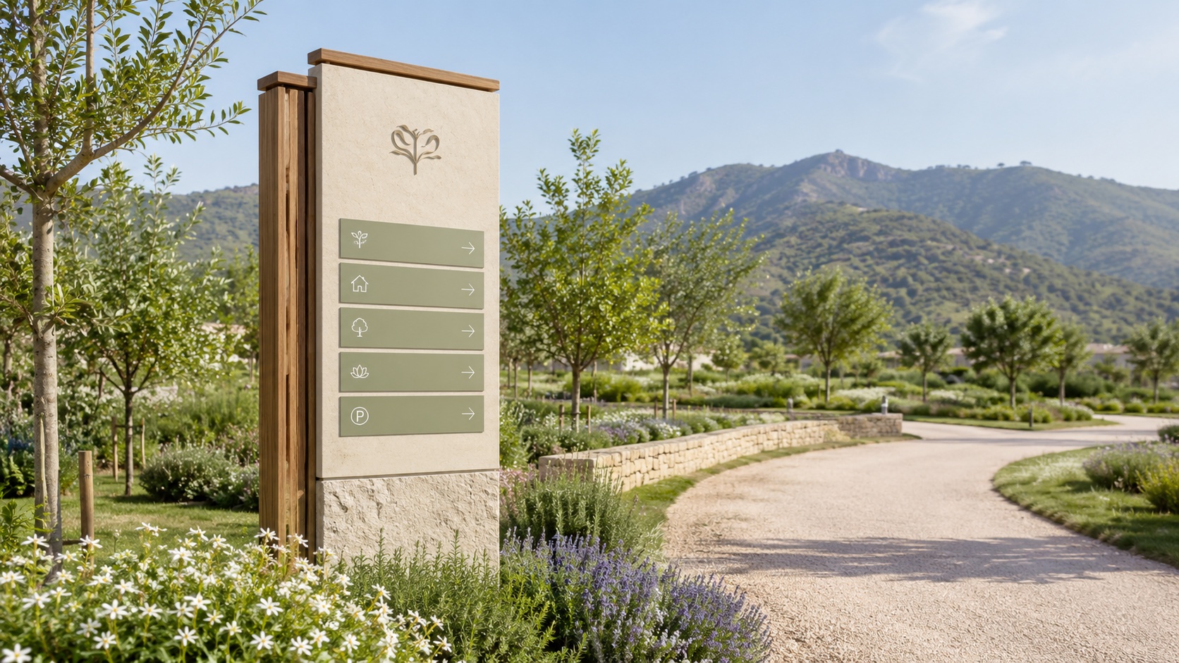
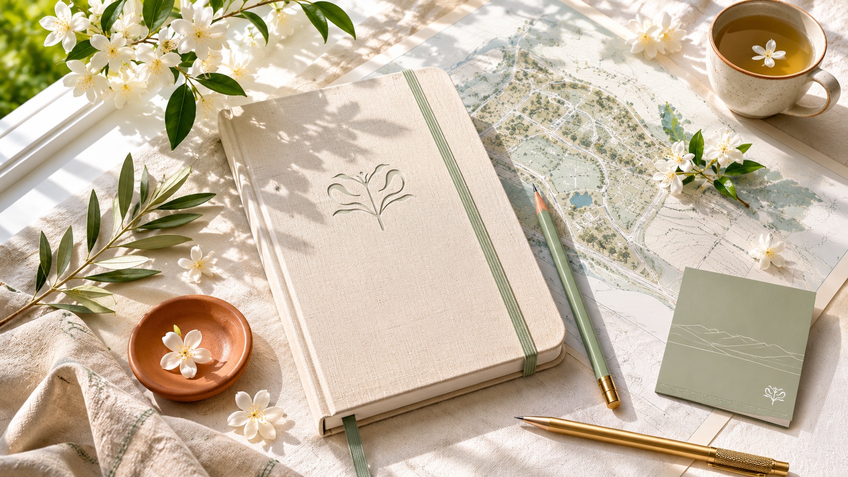
Useful, tactile objects carry the spirit of the place into everyday life.
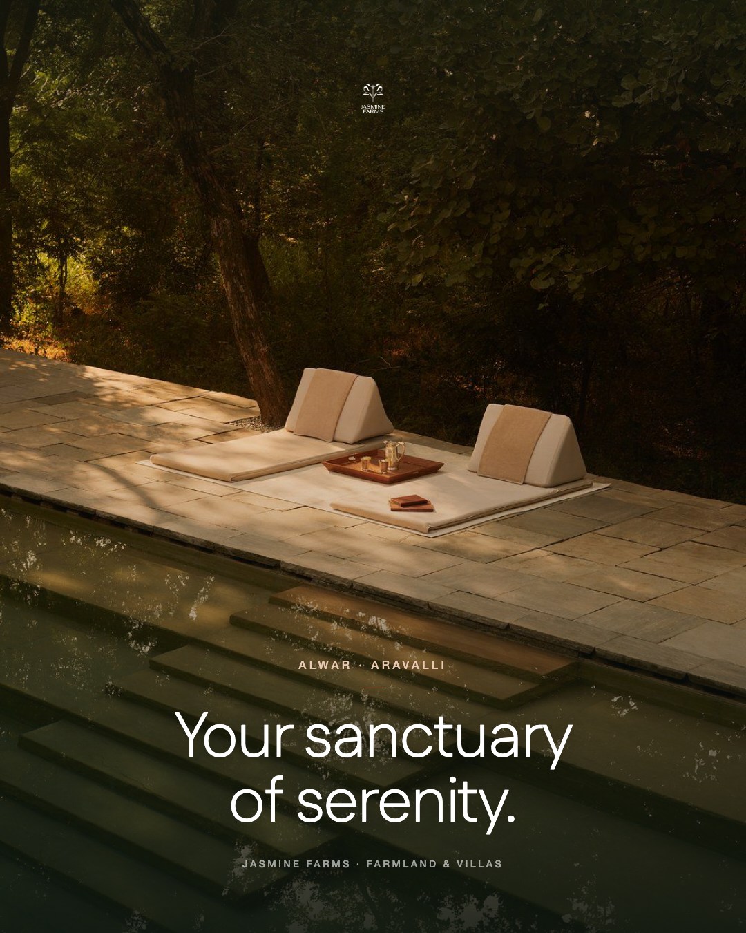
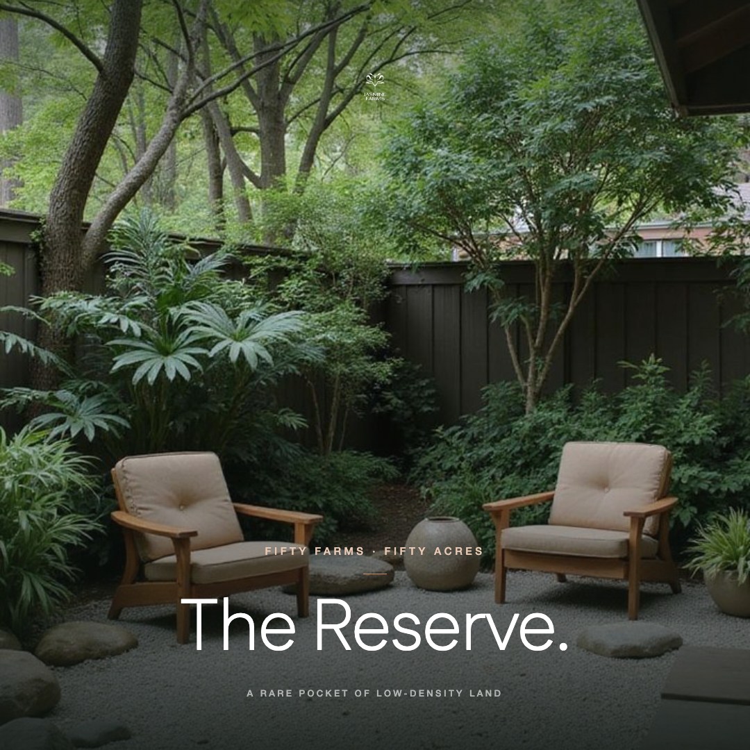
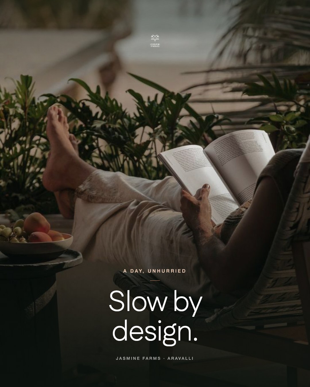
Campaign art direction · Three stories, one calm.
How it speaks
Calm, warm,
never loud.
Short sentences. Plain words. Warmth over urgency. We write like a host, not a hoarding.
- The Place
Held lightly against the hills.
- The Land
Where every morning is a clean one.
- Sanctuary
Your sanctuary of serenity.
- Soil to table
From our soil to your table.
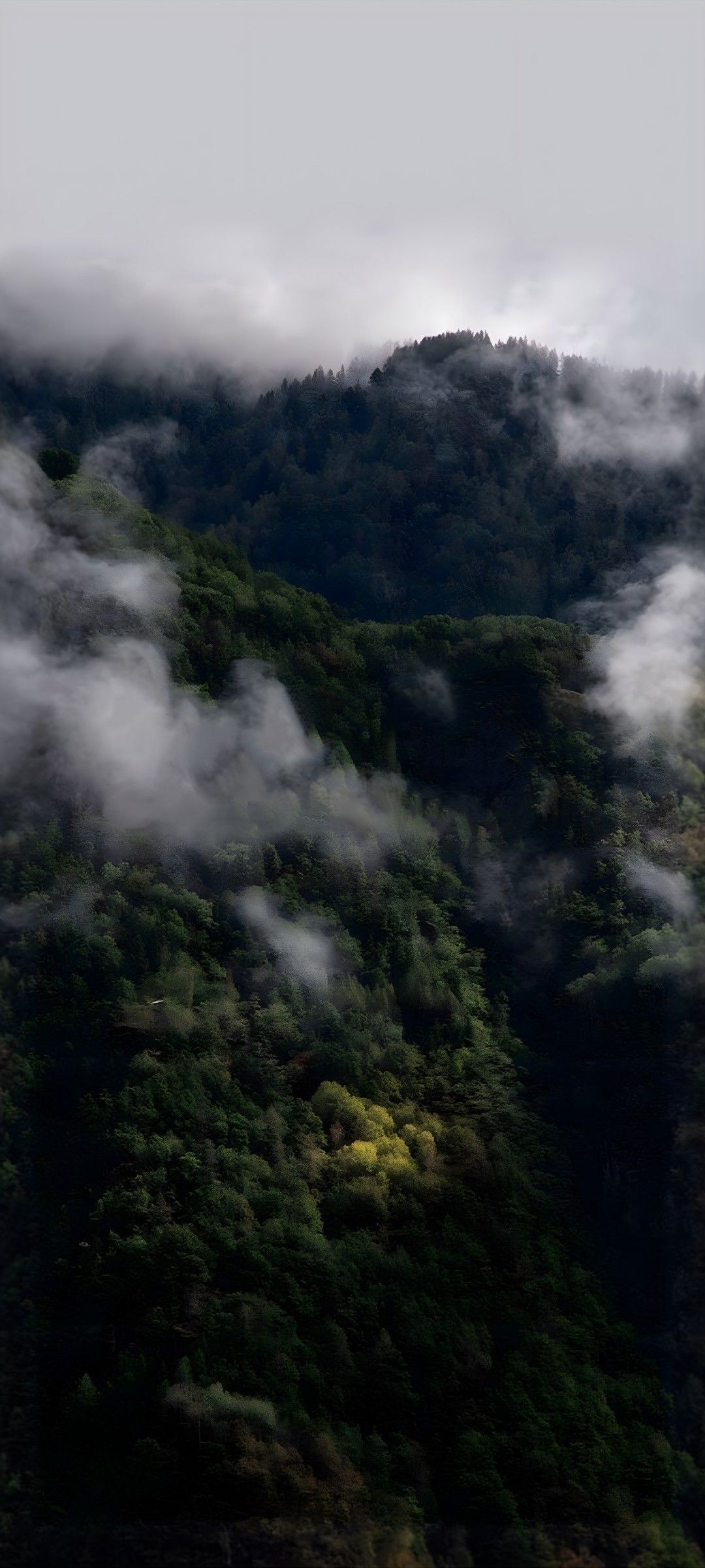
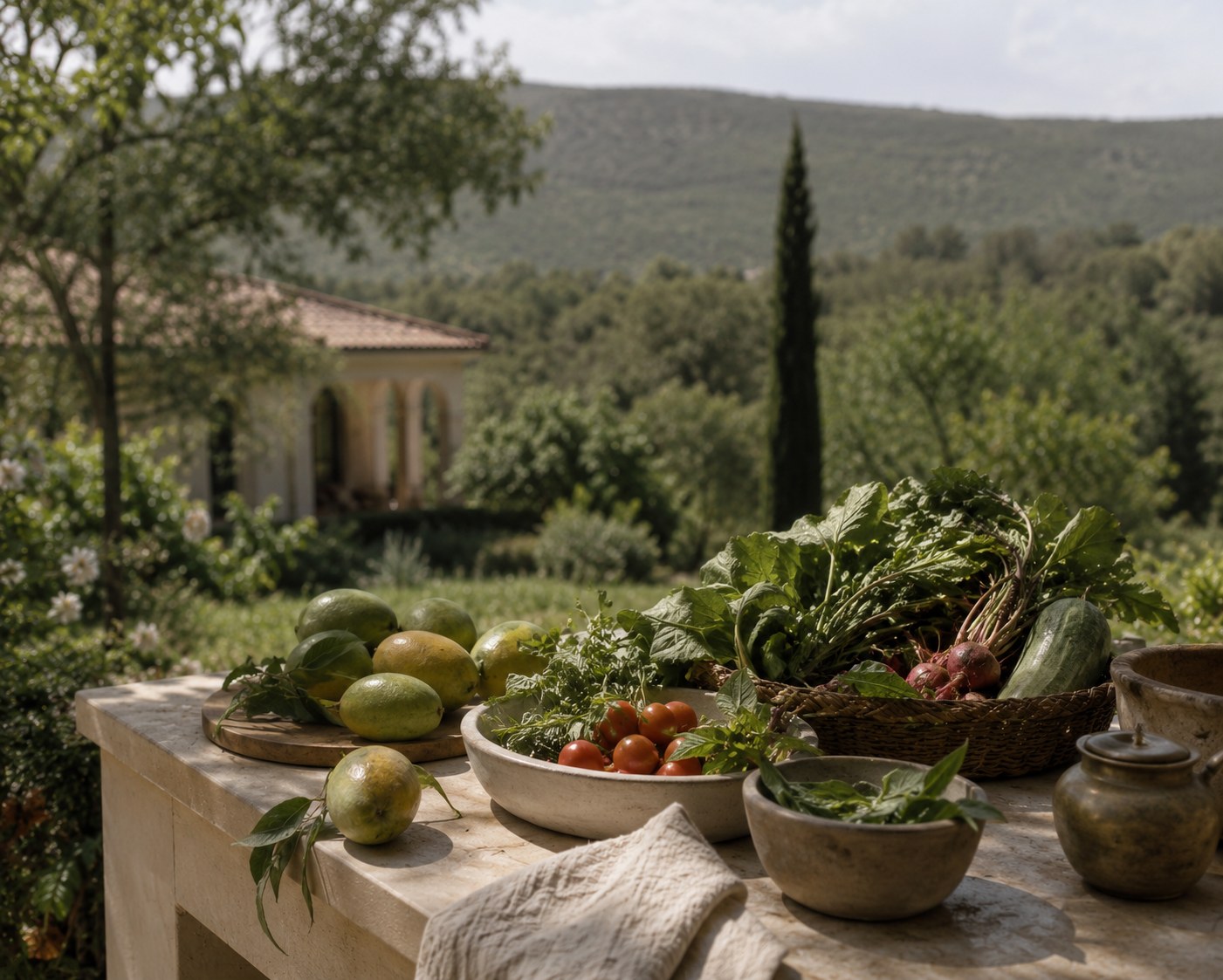
Scroll through the world

What we brought together
The mark,
put to work.
The flower and the field
Five strokes opening from a single stem. Primary for most uses; symbol or wordmark alone when space asks for it.
Field greens, kept as specimens
Estate Sage leads, Heritage grounds, Ivory Mist is the paper. Ochre is the single warm note.
The mark, put to work
Social, WhatsApp, print and stationery. Three posts, one calm. Built for the broadcast.
Project credits
Identity and brand guidelines by KURO KOKORO for Jasmine Farms, a ZAK Development.
The complete brand book
Keep turning.
A closer look at the thinking, the system
and every detail that holds it together.
Your sanctuary of serenity.
Let’s give it character.