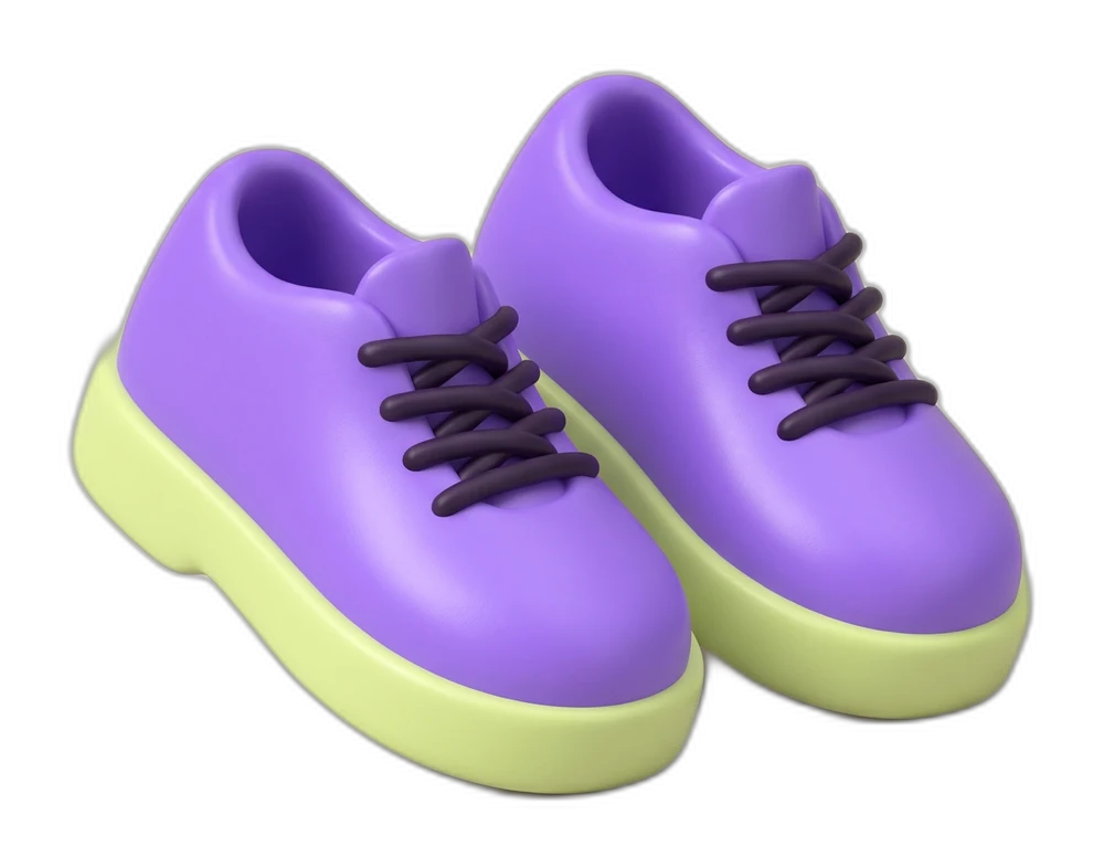
01 / Find your pickup
Aquí nos vemos.
A walking gesture leads you to the meeting point.

A brighter way
to get there.
Keeping Pronto’s original letterforms, we built a more distinctive world around the ride. Sculptural forms, familiar faces and a continuous route connect the identity, app and campaign. This independent concept makes every touchpoint feel like part of the same journey, from first tap to arrival.
Tu ciudad, más cerca.
The route becomes the signature
A voice with momentum
Open shapes. Confident weight.
Short words that keep things moving.
#7042C4#F7F5F0#231536#9063FE#DDF19A#F5974B03 / Character in every detail
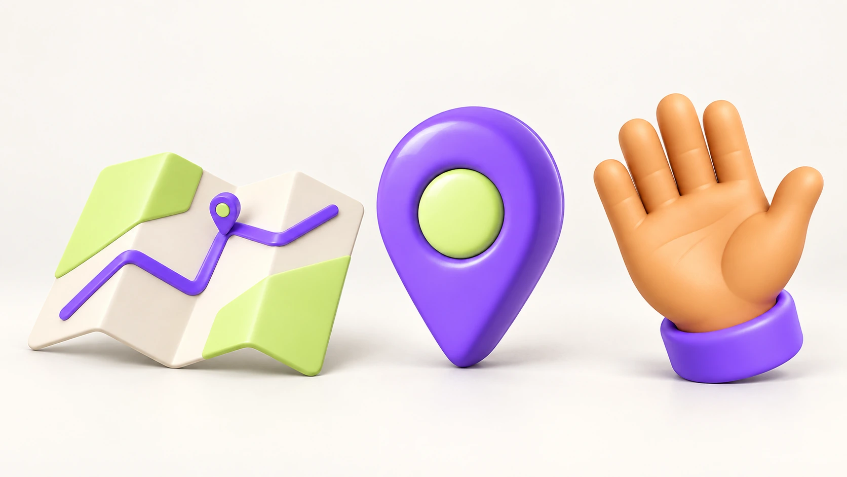
Rounded forms, tactile surfaces and a recognisable violet. Everyday objects become a family, from finding your destination to saying hello.
People give the city its character
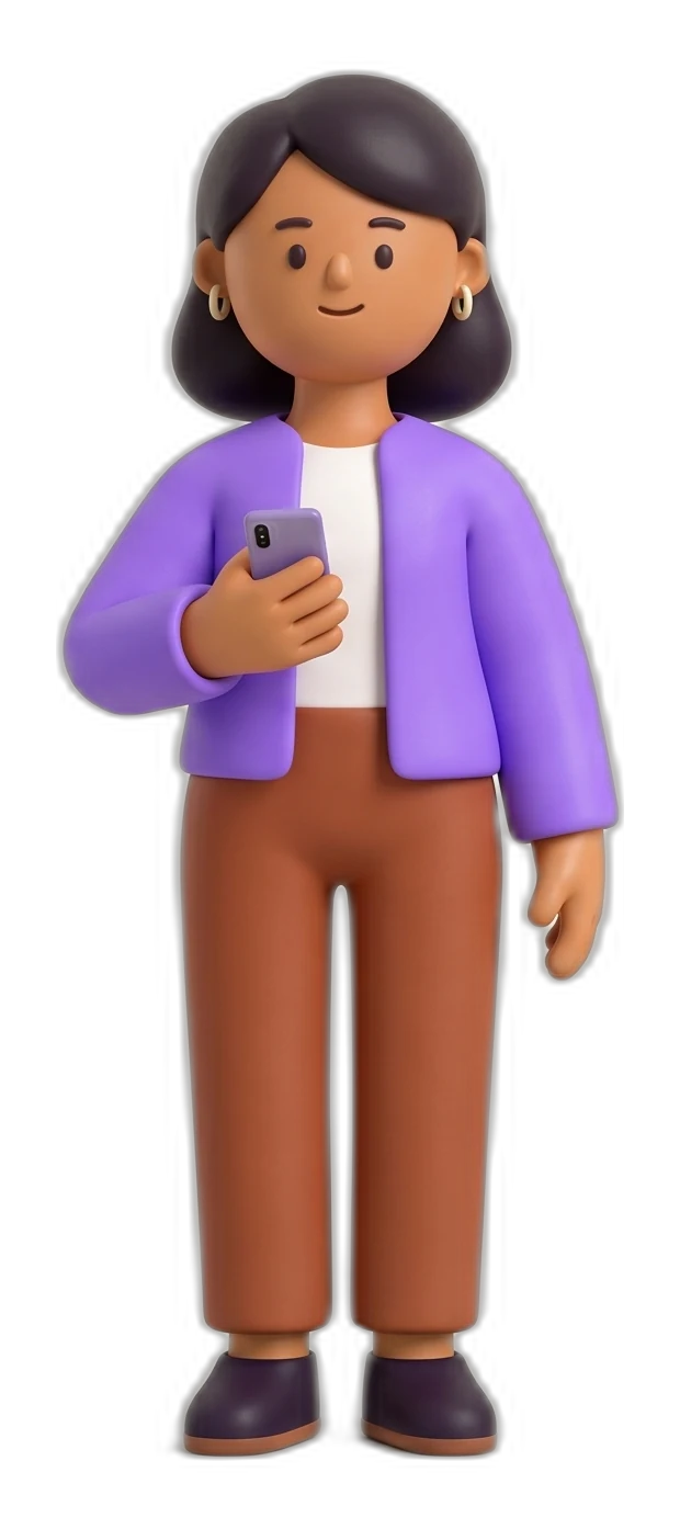
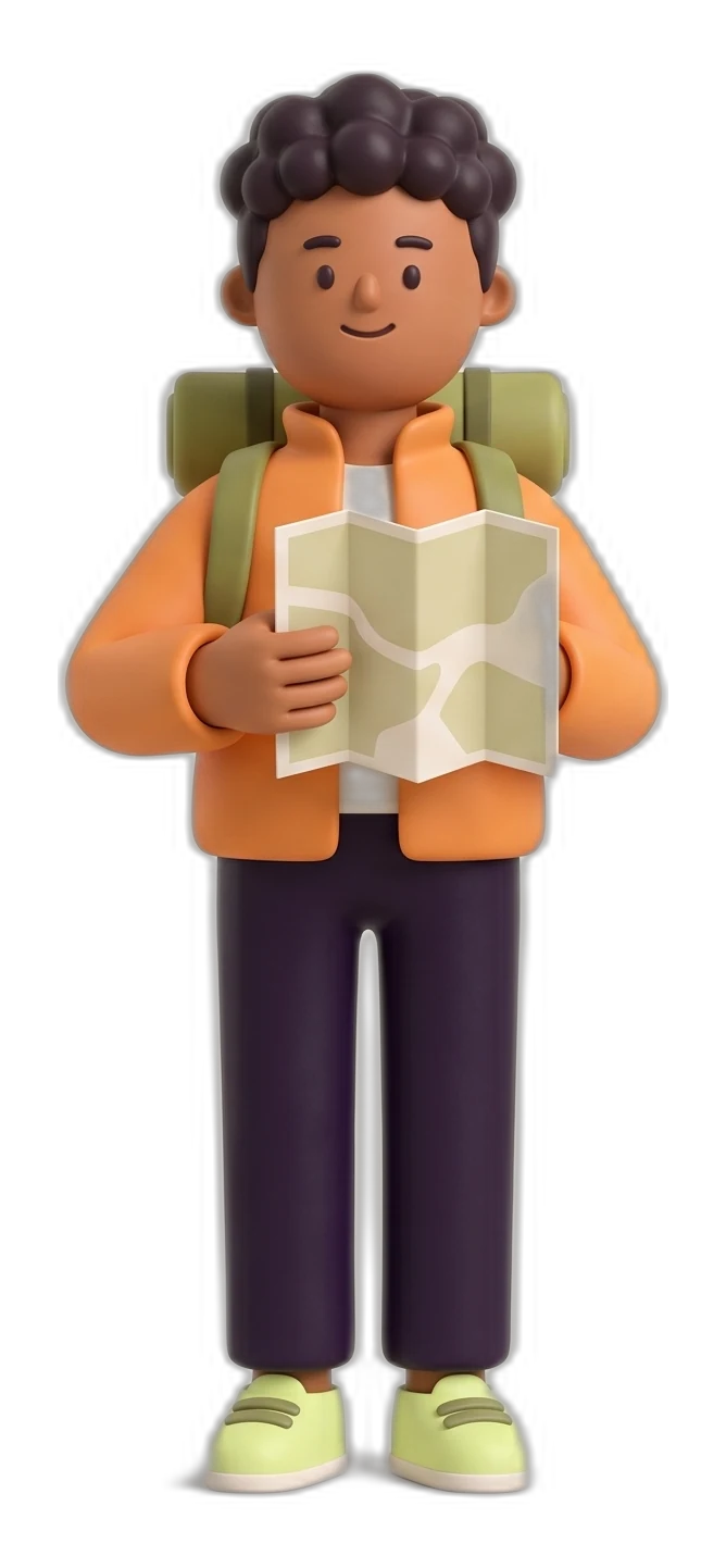
Soft forms, clear silhouettes and a little expressive exaggeration. An original, fictional cast brings warmth to the everyday moments around a ride.
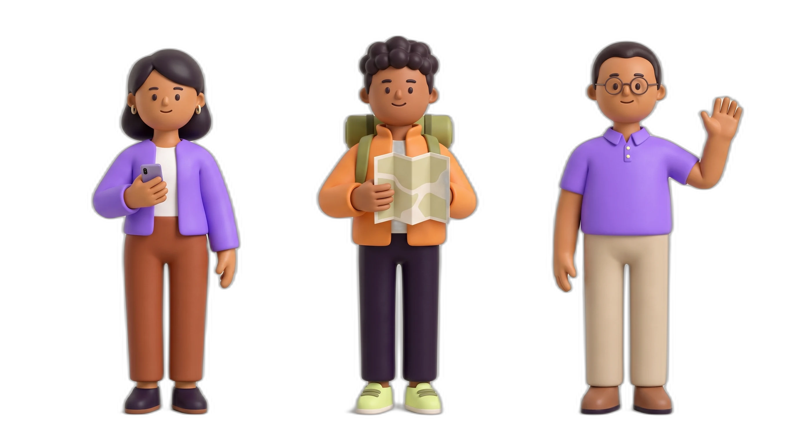
The everyday rider
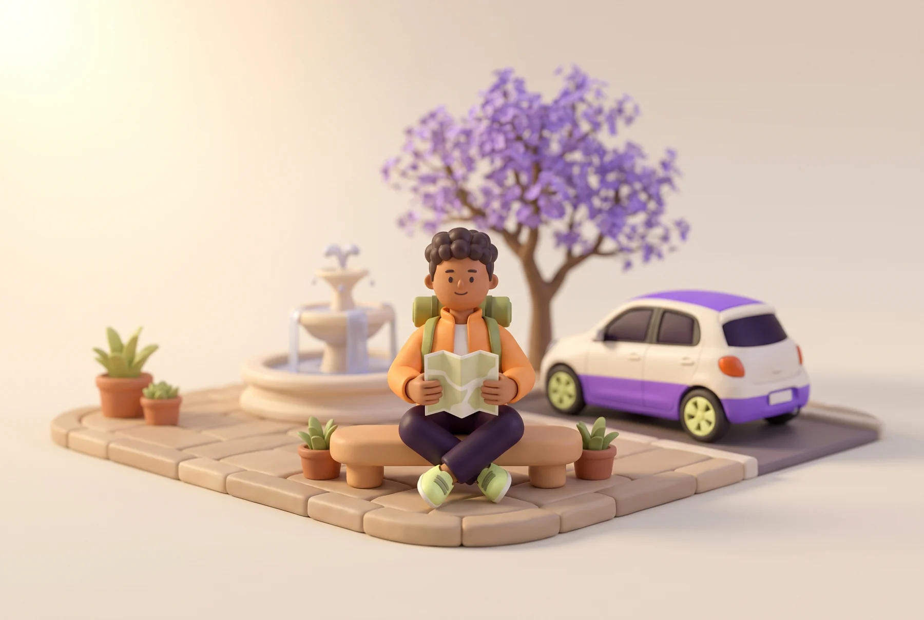
Violet jacket. Rust trousers.The city explorer
Orange jacket. Ink trousers.The driver
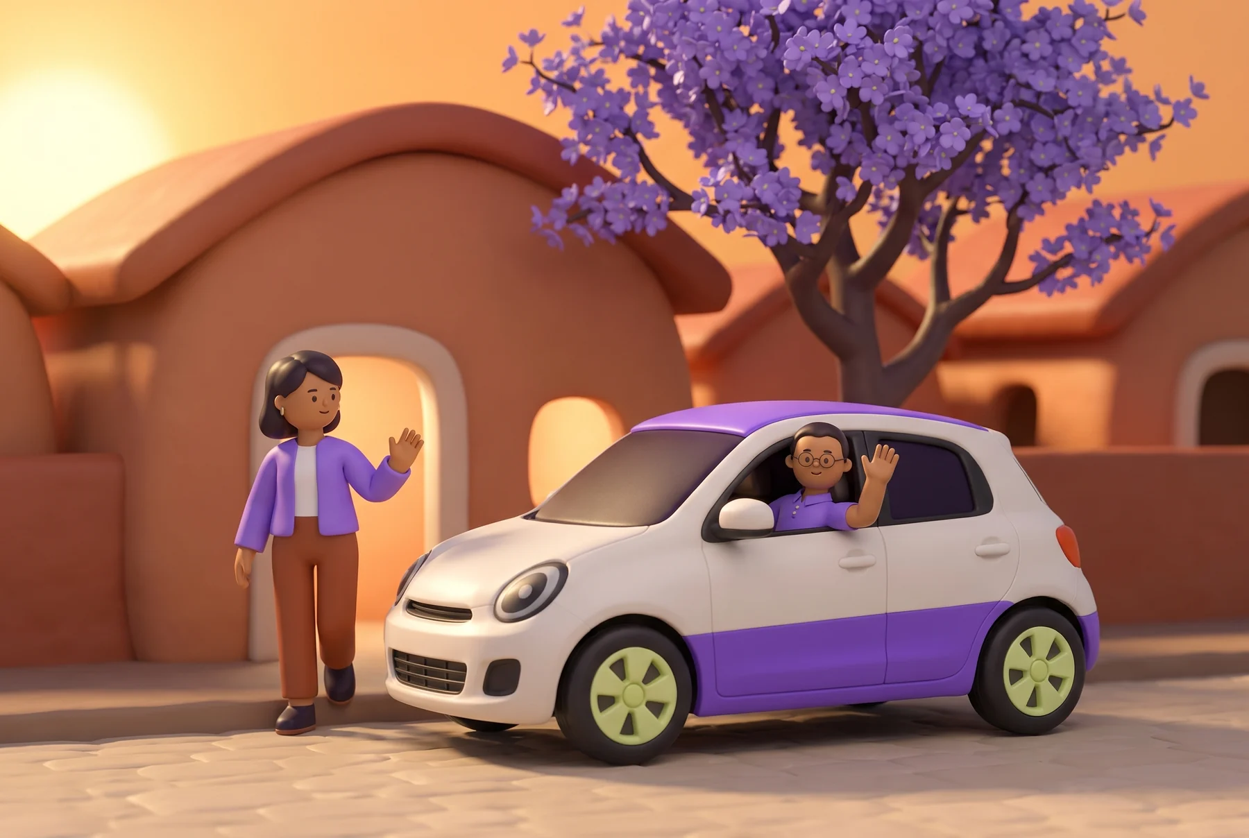
Violet polo. Sand trousers.The character film
Alma, Nico and Rafa.
Different plans. One connected city.
A Pronto motion study · Original character artwork, brought together through motion.
Download film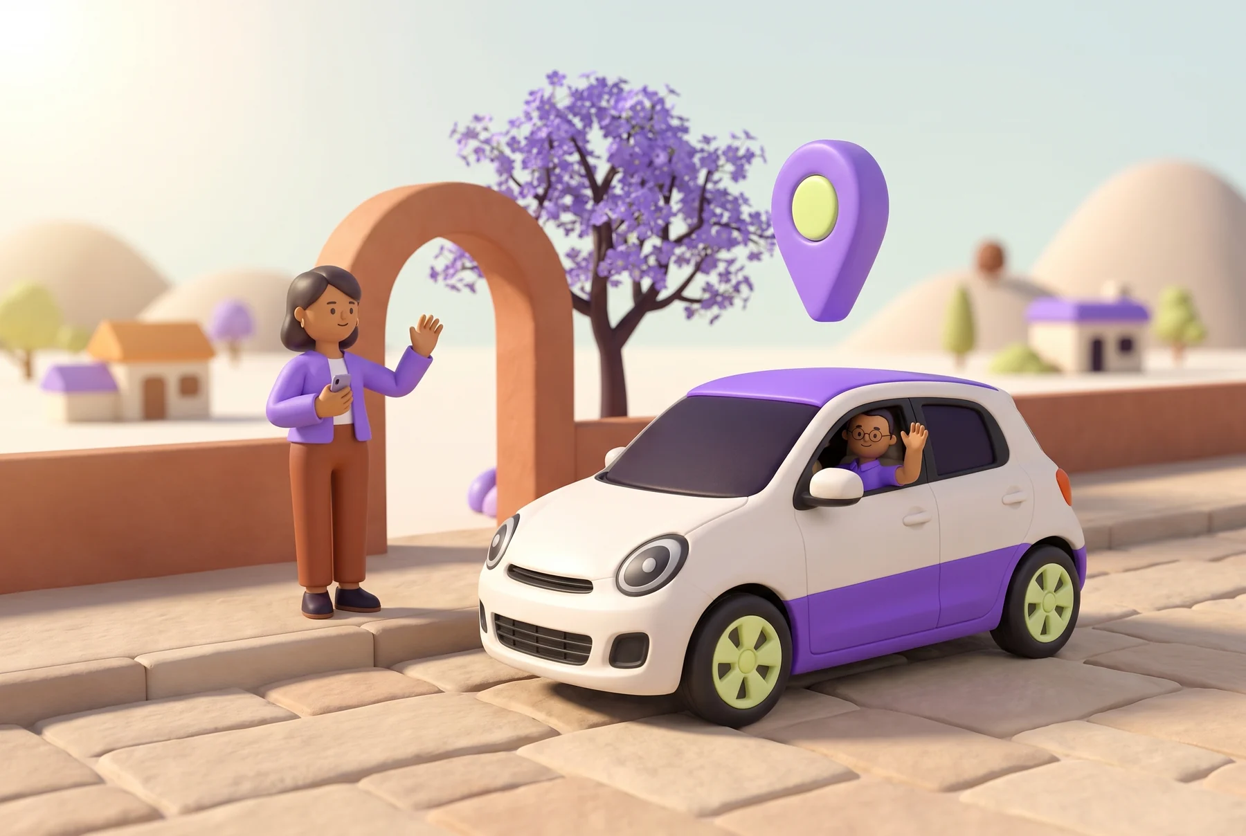
Nos vemos aquí.
A clear meeting point. A small wave. The journey starts before the car moves.
1 of 3. A familiar face at pickup.
Concept characters created for the Pronto brand world.
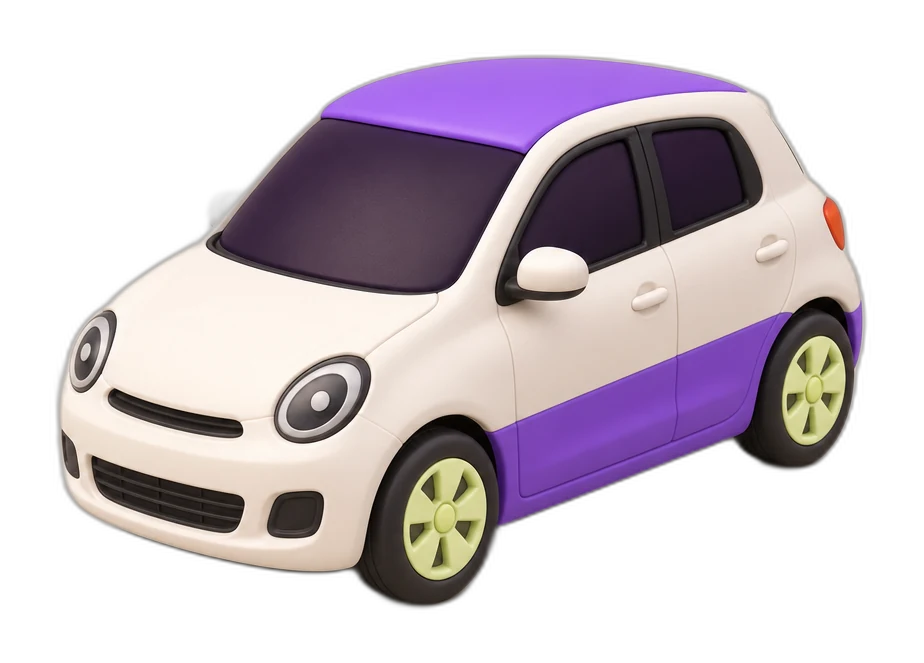
An original four-scene animated Pronto concept. A toy car, a waving hand and a map pin assemble into a playful journey, ending on Pronto’s retained wordmark in deep violet. Pause the film or choose any scene.
04 / The living world
Take the wheel. Scroll through the neighbourhood, then explore how the same world feels inside the app.
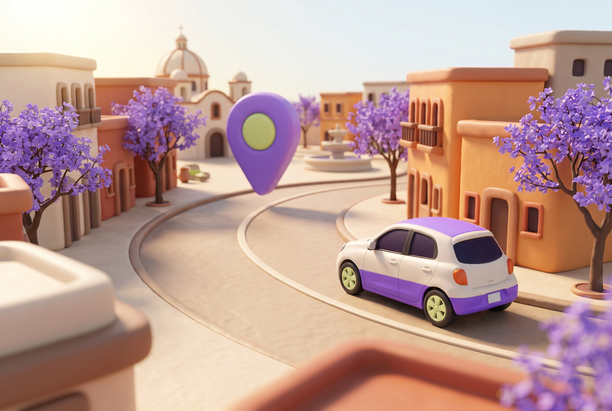 A city in motion
Tu ciudad. A tu ritmo.
Nos ponemos en marcha.
APP EXPERIENCE · DESIGN CONCEPT
Choose a destination. Follow the arrival.
A little more ease, every step of the way.
Hola, viajero.Hola, viajero. Hola, viajero.
Ya estás en Centro histórico.
Gracias por moverte con Pronto.
Interactive design concept. This preview does not book a ride.
Illustration at the point of use
A step, a turn, a conversation.
Each little picture has a job to do.
01 / Find your pickup
A walking gesture leads you to the meeting point.
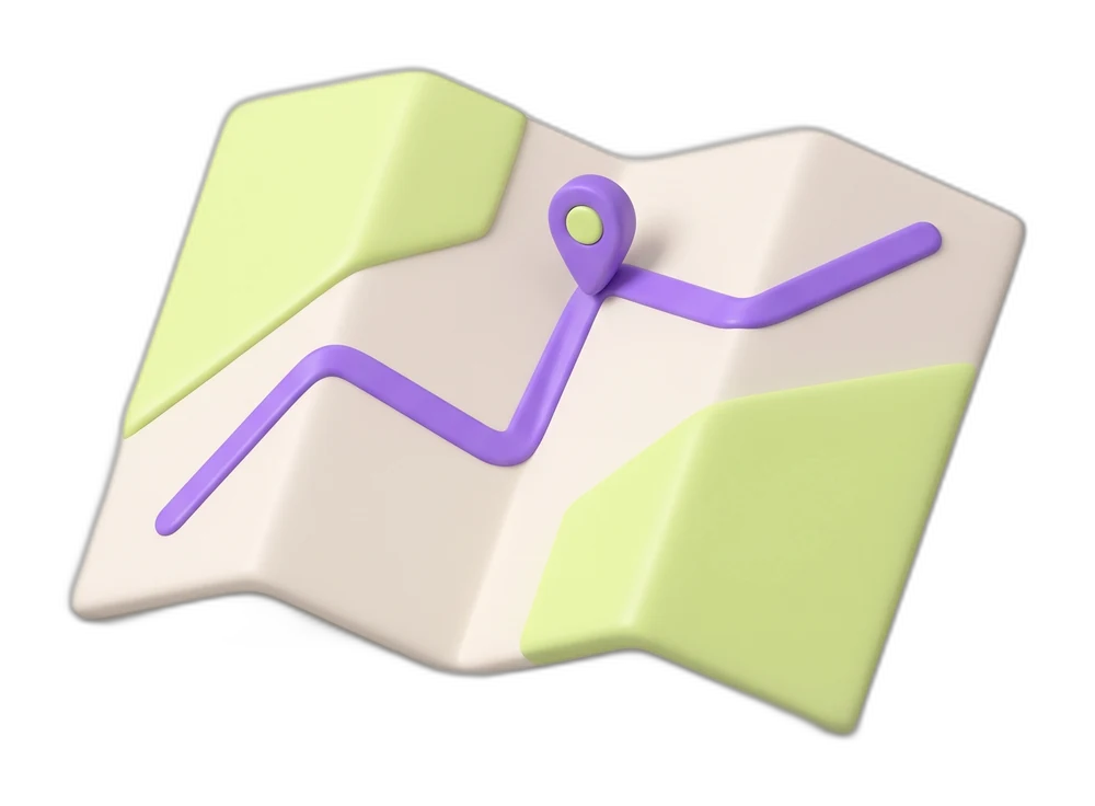
02 / Know where to go
A folded route opens into a clear destination.
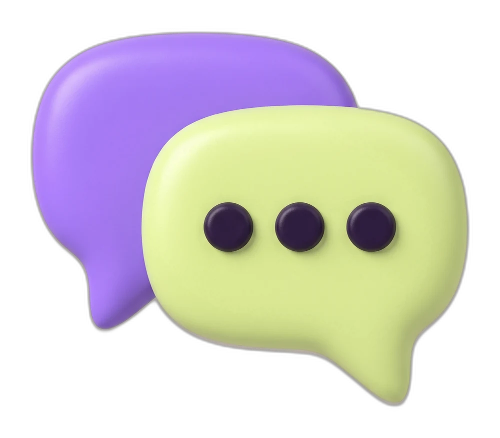
03 / Keep in touch
A conversation becomes a simple exchange of shapes.
From screen to street
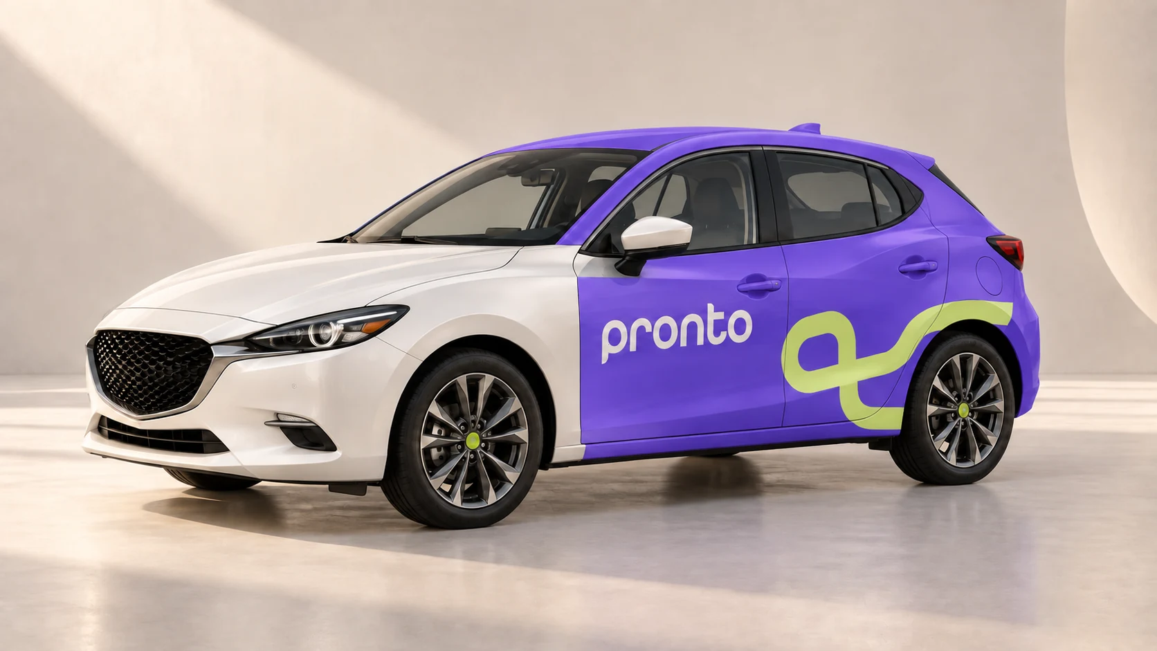
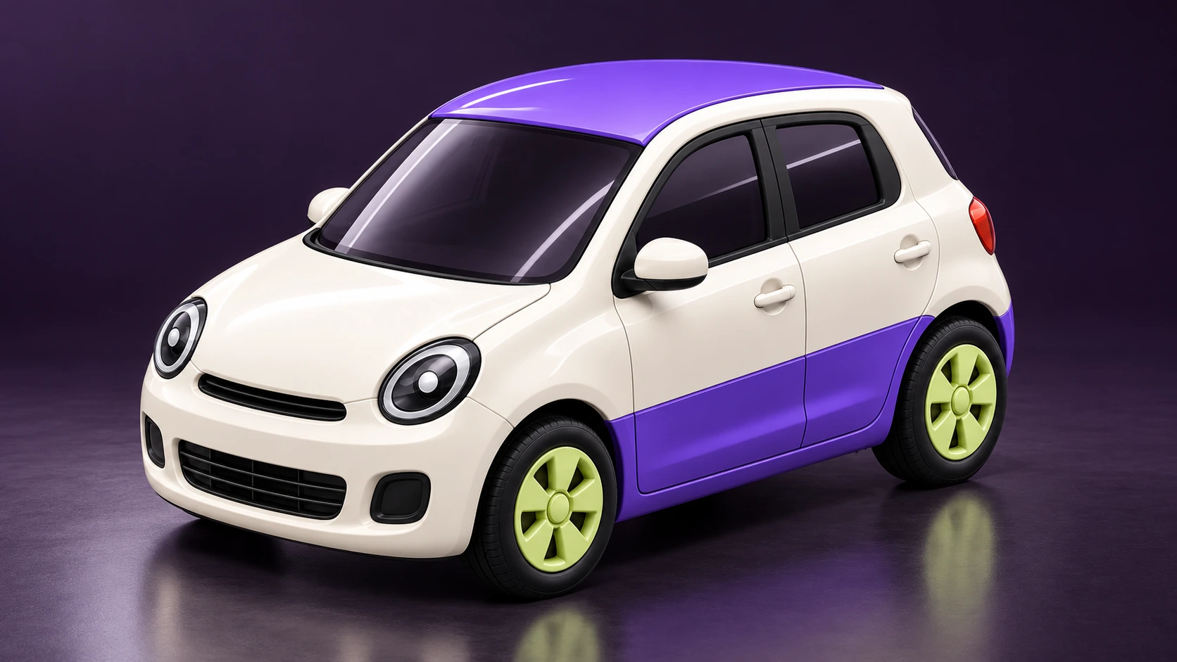
Pearl paint. Pronto violet. A route that wraps around the car.
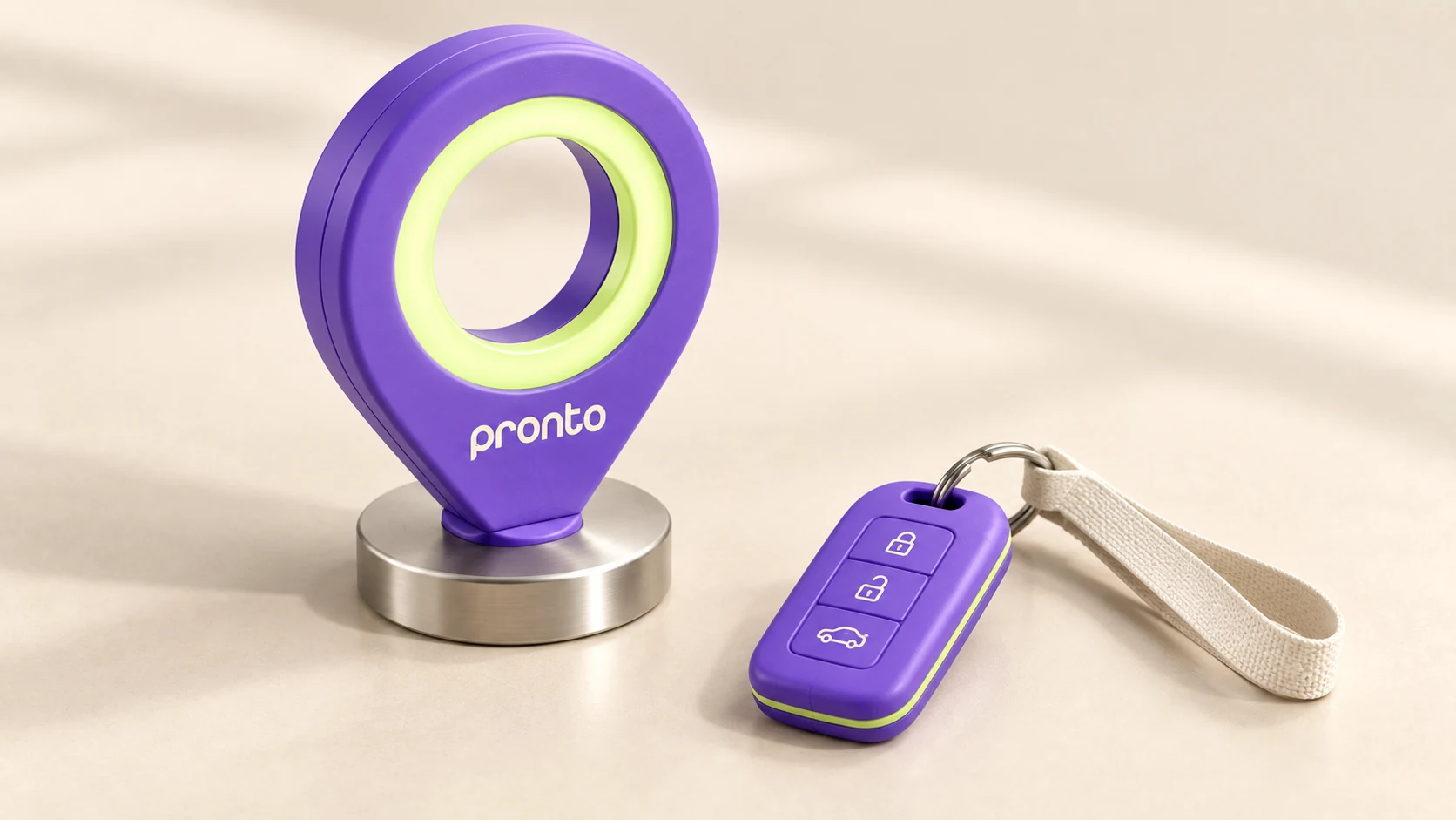
Satin violet, brushed metal and a little light to lead the way.
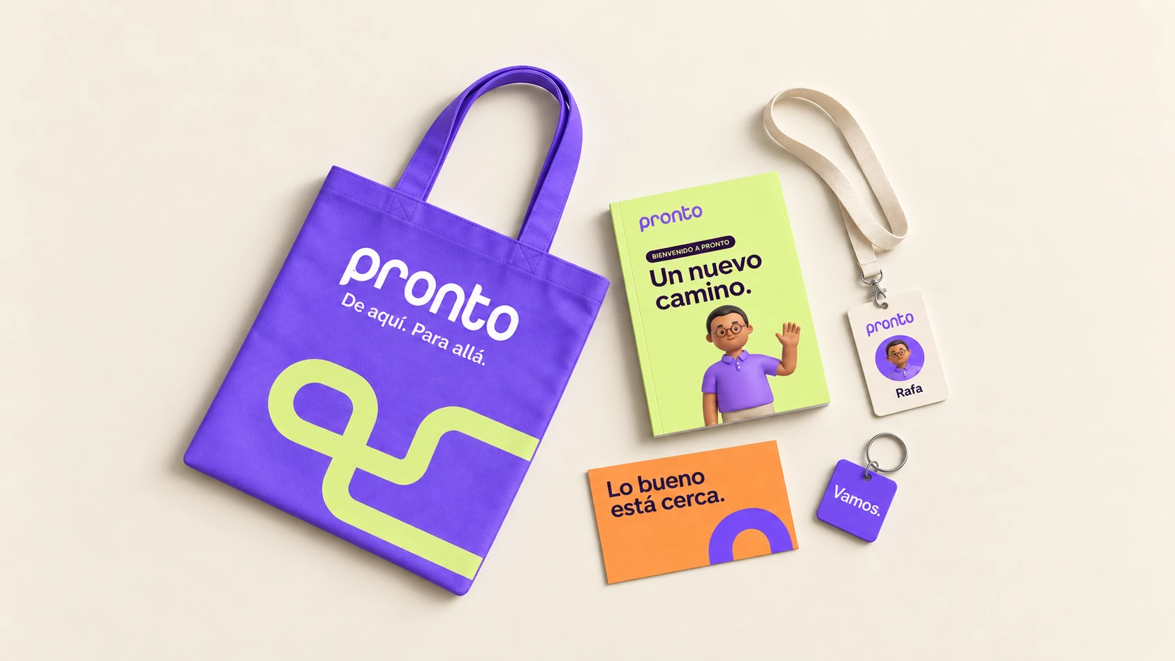
A considered welcome, from the first hello to the everyday essentials.
06 / Out in the world
The same warmth, whether you see it on your phone or around the corner. Big, simple messages make a small everyday journey feel worth looking forward to.
Tu ciudad, más cerca.
Reactions
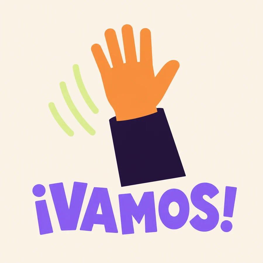
Flat, loud and quick to read. A sticker for the moment the ride is confirmed, cut from the same five colours as everything else.
Sticker system · Chat, stories and arrivalCampaign system · One route, endless ways to say it.
System notes
Four decisions connect the identity,
the characters and the experience.
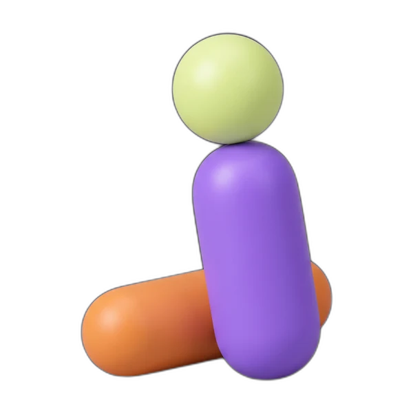
Rounded, solid parts become a modular cast. A capsule for a torso, a sphere for a head, a bar for a limb. Each figure reads as a clear silhouette before its smaller details.
Soft surfaces. One light. Space that does real work.
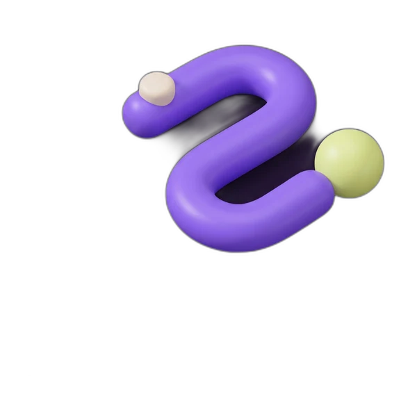
Objects arrive, settle and leave as whole pieces. A single gesture leads each scene; the accents answer with a smaller movement. The silhouette stays clear through every turn.
Whole objects. Shared rhythm. A readable pause.
The app study follows a short sequence: choose a destination, follow the arrival, finish the ride. A consistent violet action and persistent destination make that sequence easier to follow.
The tour yields to a tap. Resume returns to the sequence.
A street poster needs a short message and one strong image. A welcome kit needs quieter details. The retained wordmark, route and colour roles connect both without repeating the same layout.
One system. Different amounts of information.
A complete world, with room to grow.
An independent rebrand exploration by KURO KOKORO. Pronto’s existing wordmark anchors a proposed visual world, original coded motion and a sample app experience. This is a concept study, not a commissioned project or a functioning ride service.
Brand reference: Pronto Mexico. Case-study inspiration: Liquidink’s Rapido project. Motion direction also draws on illo’s Bazr illustration system. The artwork and animation shown here are original Pronto concept work.
Let’s make something move.
Give your brand a world. Back to all work